The solution is to mix materials and textures deliberately. Aim for a blend of five different materials that complement each other. Think about combining:
- **Soft and Hard:** A chunky knit throw draped over a sleek leather sofa.
- **Rough and Smooth:** A woven jute rug grounding a polished glass coffee table.
- **Matte and Glossy:** A rustic wood console paired with a shiny ceramic lamp.
- **Natural and Synthetic:** Linen cushions on a velvet armchair.
- **Warm and Cool:** A rich woolen blanket against a cool metal side table.
This layering of different tactile qualities creates a richer, more inviting atmosphere, making the room feel thoughtfully curated rather than hastily assembled.
Creating Visual Contrast with Color & Texture
Walking into a room where everything blends into a dull, monochromatic palette highlights another common living room design mistake: a lack of contrast. Contrast isn’t just about bold color choices; it’s about using opposites to create visual interest and depth.
The easiest approach is through color, pairing light and dark tones—like a pale wall with a deep-hued sofa—to elevate the space. But contrast extends beyond light-dark; it also encompasses mixing warm and cool tones, such as a cozy terracotta accent against a crisp cool grey. Furthermore, contrast applies to textures (e.g., a smooth leather sofa against a nubby wool rug), shapes (incorporating round elements to break up angular furniture), and even finishes (matte surfaces against glossy ones). These intentional juxtapositions prevent the room from feeling flat, creating a layered and dynamic aesthetic. When introducing colors, repeat a chosen hue on at least three different objects in the room, ensuring variation in shade or texture to maintain interest.
Intentional Accessorizing: Less is More
Small trinkets and charming decor items can quickly accumulate, leading to visual clutter rather than curated style. This common living room design mistake overwhelms surfaces, making a space feel messy even if individual items are lovely. The problem with too many small accessories is their inability to make a significant impact individually, leading us to overcompensate.
Instead, adopt an “intentional accessorizing” approach: use fewer, larger statement pieces. Think of accessories as the seasoning for a dish – a pinch enhances, but too much ruins. Don’t feel obligated to fill every surface. A few thoughtfully chosen and well-placed items will have a far greater impact, creating a refined and cohesive look without the visual noise. Focus on impact over quantity.
Illuminating Your Space: Getting Lighting Temperature Right
Lighting profoundly impacts a living room’s ambiance, and using the wrong color temperature is a frequent living room design mistake. Get it right, and your space feels warm, inviting, and cozy. Get it wrong, and it can feel sterile and clinical.
The sweet spot for living room lighting is typically up to 4,000 Kelvin. Lower Kelvin values (around 2,700K to 3,000K) produce a warm, golden glow, perfect for creating a cozy, relaxing evening atmosphere. Around 3,000 Kelvin, you’ll find a soft white that still feels warm but offers slightly more clarity. Anything above 4,000 Kelvin ventures into cool, bluish territory, which is excellent for task-oriented spaces like offices or kitchens, but can make a living room feel harsh and uninviting. Crucially, ensure consistency: mix-matching different color temperatures within the same room can create a jarring effect. Stick to the same Kelvin temperature across all your bulbs, and ideally, from the same brand, to ensure a cohesive and harmonious glow throughout your living room.
Measure Twice, Buy Once: The Importance of Planning
Impulse furniture purchases without prior measurement are akin to buying shoes without checking the size – a classic living room design mistake with a high probability of regret. The excitement of a new piece can easily overshadow practical considerations, leading to items that simply don’t fit or disrupt the room’s flow.
Before any shopping excursion, arm yourself with a tape measure and document your space’s dimensions, including walls, windows, and existing furniture. When you find a piece you love, compare its measurements directly against your room’s blueprint. To visualize more effectively, utilize digital floor planning tools like Magicplan, Floorplanner, or RoomSketcher, which allow you to virtually place furniture. A low-tech but highly effective alternative is to use masking tape on your floor to outline the dimensions of potential furniture pieces, giving you an accurate sense of their scale within your actual living room.
Smart Storage Solutions for a Clutter-Free Living Room
Regardless of how beautifully designed your living room is, clutter will inevitably detract from its appeal. A pervasive living room design mistake is underestimating the need for sufficient storage. We all accumulate belongings, and without designated homes, they inevitably create visual noise.
Embrace storage as an integral part of your design. Loehr’s 2-to-8 rule, which suggests that 80% of belongings should be in closed storage with only 20% on display, offers a guiding principle for managing visible items. For families or those who cherish decorative objects, this might be aspirational, but the core takeaway remains: every item needs a place. Long, low storage units, like a modular IKEA Besta system, are versatile solutions, offering ample closed storage while doubling as benches or display surfaces. In smaller living rooms, think vertically: tall bookshelves, wall-mounted cabinets, or floating shelves utilize vertical space, keeping floors clear and visually extending ceiling height. Don’t forget underutilized areas like under sofas (perfect for roll-out bins) or multi-functional pieces like storage ottomans. Baskets are also invaluable for quickly stashing away blankets, toys, or magazines, maintaining an organized and serene living room.
Comfort Over Aesthetics: Prioritizing Practicality
Finally, one of the biggest living room design mistakes is prioritizing looks over comfort and functionality. A sofa that appears stunning in a magazine but is uncomfortable to sit on, or a beautiful white couch in a home with pets and children that demands constant cleaning, misses the point of a living room. This space should invite relaxation and real-life living, not just admiration.
Consider practicality from the outset. Opt for kid and pet-friendly fabrics if necessary. Ensure your sofa offers adequate back support and that materials are suitable for your climate (e.g., avoiding leather in humid environments if you dislike sticking to it). Ultra-low, deep-seated sofas, while chic, can be impractical for daily use, leading to awkward perching rather than comfortable lounging. A truly well-designed living room achieves balance: aesthetics are important, but they should complement, not compromise, the way you actually live. A stylish sofa is good, but one that looks good and makes you want to sink in with a book and a cup of coffee – that’s the real win for any living room design.
From Mistakes to Masterpiece: Your Living Room Q&A
What is a common mistake when choosing living room furniture?
A common mistake is using furniture that is the wrong size for your living room, making the space feel either too crowded or too empty.
Where is the best place to put my TV in the living room?
The ideal TV placement is with its center at eye level when you are seated, typically around 42 to 48 inches from the floor, to ensure comfortable viewing.
How can I make my living room feel taller and more spacious with curtains?
Mount your curtain rod much higher than the window frame, ideally halfway to two-thirds up towards the ceiling, to create an illusion of taller windows and higher ceilings.
How can I make a large living room feel more comfortable and less empty?
Instead of pushing all furniture against the walls, ‘float’ your furniture by bringing pieces inward to create cozy, defined conversation areas.
Why is it important to mix different textures in my living room design?
Mixing textures, like soft throws with a sleek sofa or a rough rug with a smooth table, adds visual interest and depth, making the room feel more inviting and thoughtfully designed.
Ever walked into your living room, taken a deep breath, and thought, “Something just isn’t right”? Perhaps you’ve invested considerable time, money, and effort into decorating, yet the space feels off, lacks warmth, or simply doesn’t feel like ‘home’. It’s a common scenario, and often, the culprit isn’t a lack of taste but rather a few common living room design mistakes that subtly undermine the entire aesthetic. The video above dives into 21 such pitfalls, offering invaluable insights into identifying and rectifying them.
This article builds upon those foundational tips, providing a comprehensive guide to transform your living room into a truly inviting and functional sanctuary. We’ll explore how to avoid these frequent missteps, ensuring your space reflects comfort, balance, and your unique style. Let’s delve into creating a living room that truly feels right.
Getting Furniture Scale Right: The Foundation of Good Design
One of the most frequent living room design mistakes stems from improper furniture sizing. It’s easy to fall in love with a sofa in a spacious showroom, only to find it dwarfs your living room or, conversely, looks like dollhouse furniture in a grand space. The key is to think about “breathing room” for each piece.
Consider your sofa, a central anchor in most living rooms. It should fit comfortably along a wall, allowing at least 18 inches (approximately 45 centimeters) of wall space on each side. This margin prevents it from crowding corners or blocking doorways, ensuring a natural flow. Furthermore, selecting pieces with slimmer profiles and visible legs can visually expand smaller rooms, lending an airier feel. Conversely, in larger living rooms, bulkier, more grounded furniture helps to anchor the space, preventing it from appearing sparse or empty.
The Golden Rules of Proportion for a Balanced Living Room
Beyond individual furniture sizing, the balance between pieces is crucial. This is where the “two-thirds rule” comes into play, a guideline rooted in the golden ratio – a proportion frequently observed in nature and classical architecture for its inherent aesthetic appeal. When applying this to your living room:
- Your sofa should ideally be about two-thirds the width of the wall it sits against. This prevents it from looking either too small or overwhelming for the space.
- Your coffee table should be approximately two-thirds the width of your sofa. This ensures it’s substantial enough to be functional and visually connected to the seating area without dominating it.
- For your television, aim for it to be two-thirds the width of the console or unit beneath it. This creates a visually stable and harmonious setup.
While the two-thirds rule offers an excellent starting point, a range between half to three-quarters can also work effectively, depending on your specific pieces and room dimensions. Another crucial guideline is that the base should always be wider than what is placed on top. For instance, your TV stand should always be wider than your TV to provide a sense of stability. Similarly, your area rug should extend at least 15 centimeters (about 6 inches) wider than your sofa on each side. This ensures the rug grounds all your seating, defining the space rather than appearing to float aimlessly.
Avoiding Neck Strain: Optimal TV Placement
Mounting your TV too high is a remarkably common living room design mistake, often leading to discomfort and an unbalanced room aesthetic. Just like sitting in the front row of a cinema, a high TV at home can cause neck strain during prolonged viewing. Beyond comfort, a TV mounted too high awkwardly pulls the eye upward, disrupting the room’s visual harmony. This frequently occurs when TVs are placed above fireplaces, a popular spot that often sacrifices ergonomic viewing for perceived convenience.
The ideal placement for your TV is with its center at eye level when you are seated. This generally means the middle of the screen should be around 42 to 48 inches (107 to 122 centimeters) from the floor. If a fireplace is your only option, consider a mantel mount that allows the TV to be lowered for viewing and raised when not in use. Alternatively, mounting the TV on an adjacent or perpendicular wall to the fireplace can be a much more comfortable and aesthetically pleasing solution. Modern innovations like Frame TVs, which mimic artwork, offer greater flexibility for slightly higher placements without compromising the room’s balance.
Adding Height and Dimension: Layering Your Living Room Decor
Imagine a city skyline where every building is the same height – monotonous, right? Your living room can suffer from a similar lack of visual interest if all your furniture and decor are at a uniform, lower level. This common living room design mistake results in a “bottom-heavy” space that feels like it’s sinking into the floor.
The solution is to introduce vertical variety, creating a dynamic “skyline” within your room. Think in layers: foundational pieces (sofas, rugs, large cabinets), mid-level elements (coffee tables, armchairs, side tables), and crucial vertical players. The vertical layer is where you add floor lamps, tall plants, wall sconces, bookshelves, or oversized art. Hanging curtains significantly higher than the window frame, extending them closer to the ceiling, also tricks the eye into perceiving taller windows and higher ceilings, providing a subtle “facelift” for the room.
Curtain Call: Hanging Curtains Like a Pro
Speaking of curtains, their proper placement and sizing are often overlooked living room design mistakes that significantly impact the perceived height and spaciousness of a room. Hanging curtain rods too close to the window frame, or using panels that are too short, immediately makes ceilings appear lower and rooms feel cramped.
To maximize visual impact, mount your curtain rod much higher – ideally, about halfway to two-thirds of the way between the top of your window and the ceiling. This simple adjustment creates an illusion of taller windows and higher ceilings, dramatically enhancing the room’s grandeur. Furthermore, ensure your curtain panels are adequately wide. Curtains should be at least two times the width of your window to achieve that luxurious, full, and gathered look. For instance, if your window measures 2 meters (approximately 79 inches) wide, your total curtain fabric should be at least 4 meters (158 inches) wide, whether across a single panel or two. This prevents them from looking stretched or skimpy when closed.
Balancing Visual Weight in Your Living Space
Another subtle yet impactful living room design mistake is uneven visual weight distribution. This isn’t about the actual poundage of your furniture but rather how “heavy” or “light” a piece appears in the room. A chunky, grounded sofa, for example, carries more visual weight than a similarly sized sofa with slender legs. If all your visually heavy pieces are concentrated on one side, the room will feel lopsided and uncomfortable.
To fix this, consciously redistribute these heavy items. If a bulky sofa anchors one corner, aim to balance it with something of similar visual weight on the opposite side or across the room. Sometimes, the issue is that *everything* in the room feels heavy. In such cases, introduce lighter pieces—items made of glass, metal, or those with sleek, visible legs. These elements introduce airiness and prevent the space from feeling suffocating, creating a more harmonious and balanced environment.
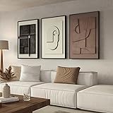
Mixing Shapes for Dynamic Design
Many modern living rooms unintentionally lean heavily into straight lines and angular structures: rectangular sofas, square coffee tables, linear bookshelves. While clean, this abundance of sharp angles can make a room feel stiff, rigid, and even monotonous. This lack of contrast in shapes is a common living room design mistake that prevents a space from feeling truly inviting.
The fix is simple: introduce curves and organic shapes. Swapping a rectangular coffee table for a round one, adding a curved armchair, or incorporating arch mirrors, vases, and sculptural lighting can instantly soften the room. These contrasting forms break up the visual grid, infusing the space with a sense of warmth, movement, and playfulness, making it far more welcoming.
Mastering Your Living Room Layout: Creating Intimate Conversation Zones
In larger living rooms, there’s a temptation to push all furniture against the walls to maximize open space. However, this often results in a cavernous, empty void in the middle and a seating arrangement that feels as impersonal as a waiting room. This is a significant living room design mistake that hinders intimacy and conversation.
The solution is to “float” your furniture, bringing pieces inward to create designated conversation zones. Start by placing your sofa in the middle of the room or within a defined open-plan area. Then, arrange armchairs around it, forming a cozy, conversational cluster. This instantly makes the space feel more intimate and functional. If you still have excess space around this arrangement, put it to good use. A reading nook, a console table, or a plant corner can add purpose and balance, preventing the room from feeling awkwardly empty.
Defining Zones in Open-Plan Living
Open-plan living offers a sense of airiness, but its lack of built-in boundaries can lead to a sprawling, undefined space. This is where strategic zone creation becomes essential, preventing one of the key living room design mistakes in open layouts.
Rugs are your best friend here; a large rug under your seating area immediately defines it as the living zone. Furniture placement also acts as a natural divider: use the back of a sofa, a console table, or a low bookshelf to delineate areas without blocking light or flow. Sectionals are particularly effective in large open spaces, naturally carving out a cohesive seating area. Open shelving also offers a smart way to create boundaries while maintaining visual connection and light flow between zones. Finally, don’t underestimate the power of lighting – a pendant light over a dining table or a floor lamp beside a sofa visually separates different functional areas.
Beyond the Showroom Look: Curating a Collected Space
Buying all your furniture from a single store, especially a matching set, might seem convenient and safe. However, this common living room design mistake often results in a space that feels generic, like a showroom display, rather than a personal, lived-in home. A truly beautiful living room should feel “collected over time,” reflecting a journey of acquiring pieces with personality and history.
Embrace the art of mixing. Pair a modern sofa with a vintage coffee table, blend different wood tones, or introduce an unexpected accent chair. If you worry about chaos, anchor your eclectic choices with a cohesive color palette or repeating materials to maintain intentionality. This approach allows your individuality to shine, creating a home that feels authentic and unique.
The Power of Texture: Five Material Mixes
A living room composed entirely of smooth, flat surfaces and uniform materials can feel bland and uninspiring. This lack of textural variety is a subtle yet pervasive living room design mistake. Without depth, contrast, or “oomph,” the space loses its tactile and visual interest.
The solution is to mix materials and textures deliberately. Aim for a blend of five different materials that complement each other. Think about combining:
- **Soft and Hard:** A chunky knit throw draped over a sleek leather sofa.
- **Rough and Smooth:** A woven jute rug grounding a polished glass coffee table.
- **Matte and Glossy:** A rustic wood console paired with a shiny ceramic lamp.
- **Natural and Synthetic:** Linen cushions on a velvet armchair.
- **Warm and Cool:** A rich woolen blanket against a cool metal side table.
This layering of different tactile qualities creates a richer, more inviting atmosphere, making the room feel thoughtfully curated rather than hastily assembled.
Creating Visual Contrast with Color & Texture
Walking into a room where everything blends into a dull, monochromatic palette highlights another common living room design mistake: a lack of contrast. Contrast isn’t just about bold color choices; it’s about using opposites to create visual interest and depth.
The easiest approach is through color, pairing light and dark tones—like a pale wall with a deep-hued sofa—to elevate the space. But contrast extends beyond light-dark; it also encompasses mixing warm and cool tones, such as a cozy terracotta accent against a crisp cool grey. Furthermore, contrast applies to textures (e.g., a smooth leather sofa against a nubby wool rug), shapes (incorporating round elements to break up angular furniture), and even finishes (matte surfaces against glossy ones). These intentional juxtapositions prevent the room from feeling flat, creating a layered and dynamic aesthetic. When introducing colors, repeat a chosen hue on at least three different objects in the room, ensuring variation in shade or texture to maintain interest.
Intentional Accessorizing: Less is More
Small trinkets and charming decor items can quickly accumulate, leading to visual clutter rather than curated style. This common living room design mistake overwhelms surfaces, making a space feel messy even if individual items are lovely. The problem with too many small accessories is their inability to make a significant impact individually, leading us to overcompensate.
Instead, adopt an “intentional accessorizing” approach: use fewer, larger statement pieces. Think of accessories as the seasoning for a dish – a pinch enhances, but too much ruins. Don’t feel obligated to fill every surface. A few thoughtfully chosen and well-placed items will have a far greater impact, creating a refined and cohesive look without the visual noise. Focus on impact over quantity.
Illuminating Your Space: Getting Lighting Temperature Right
Lighting profoundly impacts a living room’s ambiance, and using the wrong color temperature is a frequent living room design mistake. Get it right, and your space feels warm, inviting, and cozy. Get it wrong, and it can feel sterile and clinical.
The sweet spot for living room lighting is typically up to 4,000 Kelvin. Lower Kelvin values (around 2,700K to 3,000K) produce a warm, golden glow, perfect for creating a cozy, relaxing evening atmosphere. Around 3,000 Kelvin, you’ll find a soft white that still feels warm but offers slightly more clarity. Anything above 4,000 Kelvin ventures into cool, bluish territory, which is excellent for task-oriented spaces like offices or kitchens, but can make a living room feel harsh and uninviting. Crucially, ensure consistency: mix-matching different color temperatures within the same room can create a jarring effect. Stick to the same Kelvin temperature across all your bulbs, and ideally, from the same brand, to ensure a cohesive and harmonious glow throughout your living room.
Measure Twice, Buy Once: The Importance of Planning
Impulse furniture purchases without prior measurement are akin to buying shoes without checking the size – a classic living room design mistake with a high probability of regret. The excitement of a new piece can easily overshadow practical considerations, leading to items that simply don’t fit or disrupt the room’s flow.
Before any shopping excursion, arm yourself with a tape measure and document your space’s dimensions, including walls, windows, and existing furniture. When you find a piece you love, compare its measurements directly against your room’s blueprint. To visualize more effectively, utilize digital floor planning tools like Magicplan, Floorplanner, or RoomSketcher, which allow you to virtually place furniture. A low-tech but highly effective alternative is to use masking tape on your floor to outline the dimensions of potential furniture pieces, giving you an accurate sense of their scale within your actual living room.
Smart Storage Solutions for a Clutter-Free Living Room
Regardless of how beautifully designed your living room is, clutter will inevitably detract from its appeal. A pervasive living room design mistake is underestimating the need for sufficient storage. We all accumulate belongings, and without designated homes, they inevitably create visual noise.
Embrace storage as an integral part of your design. Loehr’s 2-to-8 rule, which suggests that 80% of belongings should be in closed storage with only 20% on display, offers a guiding principle for managing visible items. For families or those who cherish decorative objects, this might be aspirational, but the core takeaway remains: every item needs a place. Long, low storage units, like a modular IKEA Besta system, are versatile solutions, offering ample closed storage while doubling as benches or display surfaces. In smaller living rooms, think vertically: tall bookshelves, wall-mounted cabinets, or floating shelves utilize vertical space, keeping floors clear and visually extending ceiling height. Don’t forget underutilized areas like under sofas (perfect for roll-out bins) or multi-functional pieces like storage ottomans. Baskets are also invaluable for quickly stashing away blankets, toys, or magazines, maintaining an organized and serene living room.
Comfort Over Aesthetics: Prioritizing Practicality
Finally, one of the biggest living room design mistakes is prioritizing looks over comfort and functionality. A sofa that appears stunning in a magazine but is uncomfortable to sit on, or a beautiful white couch in a home with pets and children that demands constant cleaning, misses the point of a living room. This space should invite relaxation and real-life living, not just admiration.
Consider practicality from the outset. Opt for kid and pet-friendly fabrics if necessary. Ensure your sofa offers adequate back support and that materials are suitable for your climate (e.g., avoiding leather in humid environments if you dislike sticking to it). Ultra-low, deep-seated sofas, while chic, can be impractical for daily use, leading to awkward perching rather than comfortable lounging. A truly well-designed living room achieves balance: aesthetics are important, but they should complement, not compromise, the way you actually live. A stylish sofa is good, but one that looks good and makes you want to sink in with a book and a cup of coffee – that’s the real win for any living room design.
From Mistakes to Masterpiece: Your Living Room Q&A
What is a common mistake when choosing living room furniture?
A common mistake is using furniture that is the wrong size for your living room, making the space feel either too crowded or too empty.
Where is the best place to put my TV in the living room?
The ideal TV placement is with its center at eye level when you are seated, typically around 42 to 48 inches from the floor, to ensure comfortable viewing.
How can I make my living room feel taller and more spacious with curtains?
Mount your curtain rod much higher than the window frame, ideally halfway to two-thirds up towards the ceiling, to create an illusion of taller windows and higher ceilings.
How can I make a large living room feel more comfortable and less empty?
Instead of pushing all furniture against the walls, ‘float’ your furniture by bringing pieces inward to create cozy, defined conversation areas.
Why is it important to mix different textures in my living room design?
Mixing textures, like soft throws with a sleek sofa or a rough rug with a smooth table, adds visual interest and depth, making the room feel more inviting and thoughtfully designed.