Have you ever walked into a room in your own home and felt a subtle sense of unease, a nagging feeling that something just isn’t quite right? Perhaps the space feels cold, disconnected, or simply lacks that inviting “wow” factor you envision. It’s a common experience, a phenomenon many homeowners encounter without fully grasping the underlying design principles at play. Oftentimes, the culprit isn’t a lack of style or investment, but rather a few fundamental home decorating mistakes that are surprisingly easy to overlook, yet profoundly impactful.
In the video above, our expert generously shares seven such common decorating pitfalls, drawing from hundreds of real-life examples submitted by her viewers. She reveals that these aren’t niche blunders, but widespread issues she observes repeatedly, even admitting to having made every single one herself. This candid approach makes the advice incredibly relatable. Building on her valuable insights, this article delves deeper into these pervasive decorating mistakes, offering expanded context, expert analysis, and actionable strategies to transform your living spaces from merely functional to truly captivating.
Decoding Common Home Decorating Mistakes for an Elevated Aesthetic
Mastering the art of interior design often comes down to understanding proportion, scale, and visual balance. These elements, when mismanaged, can lead to rooms that feel off-kilter or unfinished. Let’s unpack the most frequent home decor missteps and equip you with the knowledge to create a home that not only looks stunning but feels inherently right.
1. The Art of Placement: Scale and Height in Artwork
It’s an irony of design: artwork, intended to be a focal point, can often become a visual afterthought due to improper placement. Many decorators, both novice and experienced, routinely make the error of selecting pieces that are either too diminutive for the wall space or hanging them at an awkward height. Imagine a vast canvas of a wall with a postage stamp-sized picture—it simply floats, lacking any visual anchor. Conversely, artwork crammed too high near the ceiling feels disembodied, requiring an uncomfortable upward gaze.
The solution lies in adhering to optimal scale and height. A universally accepted design guideline for hanging artwork is to center it at eye level, typically between 57 to 61 inches from the floor to the center of the piece. This range accommodates varying ceiling heights and average human eye levels, ensuring the art is effortlessly viewable. Think of it like a perfectly tailored suit; the fit makes all the difference. When in doubt, lean towards larger pieces. A grand statement piece can anchor a wall, drawing the eye and lending gravitas to the room in a way smaller, multiple pieces often cannot.
If a single piece feels inadequate, a well-curated gallery wall is an excellent strategy. This allows you to combine smaller frames into a cohesive, larger visual unit, effectively occupying the necessary space. Alternatively, flank smaller artworks with wall sconces or slender vertical elements. This creates a broader visual footprint, giving the artwork the presence it deserves and grounding it within the broader wall composition.
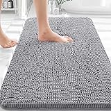
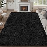
2. Anchoring Your Space: The Power of Properly Sized Rugs
Much like artwork that appears to float, an undersized area rug can leave a room feeling disjointed and ungrounded. This is perhaps one of the most common and visually jarring home styling blunders. A small rug, merely occupying the center of a seating arrangement, acts like a tiny island in a vast ocean, diminishing the room’s perceived size and severing connections between furniture pieces. The goal of an area rug is to define zones and unify elements, not isolate them.
The cardinal rule for living rooms dictates that at least the front legs of all primary seating furniture (sofas, armchairs) should rest comfortably on the rug. Ideally, if space allows, all four legs of major pieces should be on the rug, extending well beyond the furniture’s footprint. Our expert noted her own living room features an almost 10×13-foot rug, underscoring the “bigger is better” philosophy. This ensures the entire conversational grouping feels cohesive and intentional. In dining rooms, the rug must be large enough to accommodate the table and allow chairs to be pulled out without sliding off the rug’s edge. For bedrooms, the rug should extend sufficiently on both sides and past the foot of the bed, creating a soft landing spot when you rise and providing a luxurious foundation for the entire sleep zone.
Choosing an appropriately large rug is not just about aesthetics; it’s about functionality and comfort. It creates a visual boundary, absorbs sound, and adds warmth and texture underfoot. Moreover, a well-chosen rug can introduce color, pattern, and personality, instantly elevating the entire room’s ambiance.
3. Curtains: Elevating Your Room’s Verticality
The way curtains are hung dramatically impacts a room’s perceived height and spaciousness. A pervasive interior design mistake is installing curtain rods just above the window frame, a practice that visually “stumps” the room. This effectively chops off vertical space, making ceilings appear lower and windows smaller than they actually are. It’s the design equivalent of wearing high-water pants – visually awkward and shortening.
To infuse a room with a sense of grandeur and expanse, adopt the “high and wide” strategy for curtain placement. Mount curtain rods as close to the ceiling as aesthetically pleasing, typically 4-6 inches below the crown molding, or even higher if your ceiling allows and you desire maximum drama. This draws the eye upward, creating the illusion of taller windows and loftier ceilings. Simultaneously, extend the curtain rod 6-12 inches beyond each side of the window frame. This allows the curtains to stack neatly against the wall when open, exposing the full window and maximizing natural light. When closed, the ample fabric creates a luxurious, encompassing feel. Furthermore, ensure your curtains “kiss the floor,” meaning they just barely graze the surface. A slight break or puddle (1-3 inches of fabric pooling on the floor) can add a romantic touch, but curtains that are too short disrupt the vertical flow and appear ill-fitting.
Consider the fabric and style of your curtains as well. Light, airy fabrics can enhance brightness, while heavier drapes add insulation and a sense of formality. This seemingly small adjustment in curtain placement is often one of the most cost-effective yet impactful transformations you can make.
4. Breaking Free from the Walls: Strategic Furniture Arrangement
The instinct to push all furniture against the walls is a common one, perhaps stemming from a desire to maximize open floor space or a historical perception of formal arrangements. However, this often results in a rigid, uninviting room that feels more like a waiting room than a cozy sanctuary. Furniture pushed against the perimeter creates a cold, disconnected vibe, failing to foster interaction or define functional zones within the space. It can leave the center of the room feeling empty and unused.
To cultivate an inviting and dynamic environment, embrace the concept of “floating” furniture. Even a few inches pulled away from the walls can make a significant difference. The speaker, at 51, revealed how moving her sectional just slightly away from the wall transformed her living room. This creates breathing room and allows for a more intimate conversational grouping, particularly when paired with a well-sized area rug. Angle chairs to face each other or a central coffee table, rather than aligning them rigidly. Consider a circular or semi-circular arrangement, as the speaker did in her basement, to encourage natural dialogue and improve the flow of movement around the room. This strategic use of negative space around furniture makes a room feel more thoughtfully designed, drawing people into the conversation and the space itself.
Experiment with pulling key pieces like sofas, armchairs, or even console tables away from the walls. This creates depth, allows for pathways, and enables the creation of distinct “rooms within a room” in larger open-plan areas, enhancing both form and function.
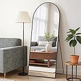
5. The Grand Entrance: Curating Your Entryway
The entryway or foyer is often a neglected space, yet it serves as the first impression of your home—both for guests and for yourself as you return each day. It’s easy for this area to devolve into a “drop zone” for keys, shoes, mail, and dog leashes, quickly becoming cluttered and unwelcoming. This lack of intentional design undermines the opportunity to set a positive tone for the entire home, much like a discordant opening note in a symphony.
Transforming your entryway involves a blend of practicality and personality. Start by identifying the essential functions of the space and then layer in elements that elevate its aesthetic. Incorporate a console table or a small bench for functionality, providing a place to set items or sit down. Storage solutions, such as decorative baskets or a stylish wall-mounted organizer, can discreetly house shoes, keys, and mail, combating clutter. A mirror is a highly effective addition, not only for last-minute checks before heading out but also for reflecting light and visually expanding the space. Artwork or a vibrant rug can introduce color, texture, and a sense of warmth. The goal is to create an area that feels welcoming, intentional, and offers a glimpse into the style of the rest of your home, effectively saying, “You’re home.”
Even in small entryways, clever choices can make a significant impact. Floating shelves, slim wall hooks, or a tall, narrow plant can add character without overwhelming the space. Curate your entryway to be both a functional buffer and an inviting overture to your personal sanctuary.
6. The Art of Cozy: Adding Layers for Warmth and Character
After meticulously arranging furniture, hanging artwork, and positioning rugs and curtains, a room can still feel sterile, cold, or unfinished. This is where the often-overlooked art of adding “cozy layers” comes into play. It’s the finishing touch that transforms a functional space into a lived-in, inviting haven, much like the perfect accessories complete a stylish outfit. Neglecting these soft, tactile elements is a common home decorating error that leaves a room feeling staged rather than genuinely welcoming.
Cozy layers encompass a range of elements that introduce texture, warmth, and personality. Start with throw pillows on sofas and armchairs; mix and match textures (velvet, linen, knit), patterns, and sizes to create visual interest and plush comfort. Drape throw blankets over seating or in decorative baskets, offering an immediate sense of warmth and an invitation to relax. Baskets themselves are multi-functional, providing discreet storage while adding natural texture. Trays, placed on coffee tables or ottomans, help corral remote controls, books, or decorative objects, creating organized vignettes. These elements soften hard lines, add depth, and infuse the room with a sense of lived-in comfort. The speaker’s example of a living room without pillows, blankets, or a tray versus one with them vividly illustrates this transformative power.
Remember, perfection isn’t cozy; real life is. Don’t be afraid to let your space look lived in and loved. These layers are what breathe life into a room, making it feel inviting and genuinely reflect your personality, creating the ultimate cozy home. By addressing these common home decorating mistakes, you can unlock your home’s full potential, crafting spaces that are not only beautiful but also deeply comforting and reflective of you.
Rectifying Room Errors: Your Q&A
How high should I hang my artwork?
A common guideline is to center your artwork at eye level, usually between 57 to 61 inches from the floor to the middle of the piece. This ensures it’s easily viewable and well-anchored on the wall.
How do I choose the right size rug for my living room?
For living rooms, make sure at least the front legs of all your main seating furniture rest comfortably on the rug. Ideally, the rug should extend well beyond the furniture to unify the space.
Where should I mount my curtain rods?
To make your room feel taller and more spacious, mount curtain rods high and wide—close to the ceiling and extending 6-12 inches beyond each side of the window frame. Ensure your curtains just barely touch or ‘kiss’ the floor.
Should I push all my furniture against the walls?
It’s often better to ‘float’ furniture by pulling key pieces a few inches away from the walls, even in smaller rooms. This creates depth, allows for pathways, and fosters more inviting conversational groupings.
What are ‘cozy layers’ in home decorating?
Cozy layers are elements like throw pillows, blankets, baskets, and decorative trays that add texture, warmth, and personality to a room. They help a space feel lived-in and inviting rather than cold or unfinished.