Mastering Your Space: Essential Fixes for Common Interior Design Mistakes
Did you know that up to 70% of homeowners report feeling overwhelmed by the interior design process? While transforming a house into a home often feels like an artistic endeavor, certain fundamental principles, when overlooked, can lead to spaces that feel disjointed, imbalanced, or simply “off.” The video above expertly highlights nine common interior design mistakes that homeowners frequently make without even realizing it. These missteps, ranging from the practical to the aesthetic, can significantly detract from the harmony and functionality of your living environment.
However, understanding these pitfalls is the first step toward rectifying them and cultivating a space that truly resonates with your personal style and enhances daily living. This comprehensive guide expands upon the video’s crucial advice, diving deeper into each common design mistake with expert insights, practical applications, and actionable strategies. Our goal is to empower you with the knowledge to identify these issues in your own home and implement sophisticated, lasting solutions that elevate your interior design.
Let’s explore these critical areas of home styling and uncover how a few intentional adjustments can make a world of difference, transforming your rooms from merely functional to truly spectacular. You don’t need to be a seasoned professional to create a beautifully curated home; rather, a keen eye for detail and an understanding of foundational design principles can guide you toward impeccable results.
Identifying and Correcting Common Interior Design Mistakes
1. Over-Reliance on Singular Light Sources
One of the most pervasive interior design mistakes is relying solely on overhead lighting. While seemingly convenient, a single ceiling fixture can cast harsh shadows, flattening the room’s dimension and creating an unflattering ambiance. Expert designers know that effective lighting is about layering, a technique that incorporates three distinct types of illumination to create depth, functionality, and mood within a space.
Firstly, **Ambient Lighting** provides the general illumination of a room, typically from overhead fixtures or large windows. Secondly, **Task Lighting** is focused and directed, designed for specific activities like reading or cooking, often provided by table lamps, floor lamps, or under-cabinet lights. Thirdly, **Accent Lighting** highlights architectural features, artwork, or decorative elements, adding drama and visual interest through spotlights or wall sconces. To cultivate a truly inviting atmosphere, aim to incorporate at least two, and ideally all three, of these lighting types. Consider warm white bulbs between 2700 and 3500 Kelvin for relaxing areas, fostering a cozy, inviting glow, or cooler white bulbs around 4000 Kelvin for workspaces where clarity and focus are paramount. Incorporating dimmers wherever possible allows for flexible ambiance control, seamlessly transitioning your space from bright and active to soft and serene with the flick of a switch.
2. The Peril of the Undersized Rug
A frequent error in home decor is choosing a rug that is too small for the designated area. An undersized rug can make a room feel disjointed and visually imbalanced, as if the furniture is floating rather than being grounded. Many homeowners succumb to this due to the significant cost and commitment associated with larger rugs, yet this particular design mistake often undermines the entire spatial arrangement.
Instead, prioritize a rug that is expansive enough to accommodate all, or at least the front two legs, of your primary furniture pieces. For a dining area, ensure the rug extends far enough for chairs to be pulled out without their legs falling off the rug’s edge, typically an additional 24-30 inches beyond the table’s perimeter. In living rooms, a good rule of thumb is for the rug to be at least 4 inches (10cm) wider on each side of your sofa, allowing either all furniture to rest fully on it or at least the front legs of sofas and armchairs to anchor the arrangement. Avoid the common pitfall of a 4×6 foot rug in a main living space; these dimensions are better suited for accent purposes or smaller rooms like a modest bedroom. Investing in a larger, more affordable rug often yields a more sophisticated and harmonious result than a premium but ill-fitting one.
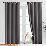
3. Curtains Hung Incorrectly
Ill-fitting curtains can drastically diminish the aesthetic appeal of a room, creating a visual awkwardness akin to wearing ill-sized clothing. Curtains that are too short, too narrow, or hung too low are glaring interior design mistakes that can make windows appear smaller and ceilings lower, fundamentally altering the perceived spaciousness of your home.
Optimal curtain length is crucial: opt for “kiss length,” where the fabric gently brushes the floor, “puddle length,” allowing a slight pooling of fabric on the ground for a luxurious look, or “floating,” where curtains hover just an inch or less off the floor. Crucially, curtain rods should be mounted high—ideally half to two-thirds of the way between the top of your window frame and the ceiling or molding—to create the illusion of soaring ceilings. Extend rods at least 4-6 inches (10-15cm) beyond the window frame on each side. This trick allows the curtains to stack off the glass when open, maximizing natural light and visually widening the window. Furthermore, ensure your curtain panels are adequately wide; a general guideline is 1.5 to 2 times the width of your window to achieve a full, gathered, and opulent appearance, preventing a skimpy, unfinished look.
4. Disregarding the Relationship Between Shape and Space
A harmonious room is one where elements visually complement each other, a principle often violated when designers ignore the relationship between an object’s shape and its surrounding space. Attempting to force a square peg into a round hole, metaphorically speaking, is a subtle yet impactful design mistake that can lead to a sense of unease or discord in a room. For instance, a long, vertical piece of artwork will likely look incongruous on a wide, horizontal wall segment, just as a boldly curved desk might clash aesthetically against a rigidly flat wall.
When selecting furniture or decor, pause to consider whether its inherent shape aligns with the contours and dimensions of its intended placement. Does a rectilinear sofa complement a room dominated by sharp angles, or would a softer, rounded piece introduce a welcome contrast? Is a circular coffee table appropriate for a compact, linear space, or would it impede flow? This mindful approach to spatial geometry ensures that each piece feels purposefully situated, contributing to an overall cohesive and aesthetically pleasing environment rather than creating visual tension. This thoughtful consideration cultivates a balanced visual dialogue throughout your home.
5. Disproportionate Furniture Choices
Proportion, a cornerstone of effective interior design, dictates the harmonious relationship between the size of various elements within a room. Failing to adhere to this principle by introducing furniture that is either too grand or too diminutive for its surroundings is a glaring interior design mistake. A colossal sectional sofa in a modest living room can overwhelm the space, making it feel cramped and inaccessible, while a tiny bedside table dwarfed by an imposing bed and lamp will appear insignificant and out of place.
Successful design requires a careful balancing act, ensuring visual weight is distributed thoughtfully. Before making any purchases, meticulously measure your room and map out potential furniture layouts. Visualize your space as a diverse cityscape, incorporating a blend of heights and scales—tall bookshelves, medium-height sofas, and lower coffee tables—to create dynamic visual interest. This strategic blend prevents a monotonous, single-level design, introducing a rich sense of depth and variety. Regularly scanning your room from different angles helps identify imbalances, allowing you to rearrange existing pieces or even remove excess items to achieve a more proportionate and aesthetically pleasing composition.
6. Overdoing Fleeting Design Trends
In the age of social media, the allure of rapidly cycling design trends from platforms like TikTok and Instagram is undeniable. However, chasing every new aesthetic often leads to a transient, impersonal space that quickly feels dated. This relentless pursuit of temporary fads represents a significant design mistake, as it can result in interiors that lack genuine character and fail to reflect the homeowner’s unique personality and enduring preferences.
While trends can offer a refreshing touch, critical discernment is key. Instead of an entire trend-driven overhaul, select timeless pieces that resonate with your personal style and incorporate trends sparingly through easily swappable elements like throw pillows, artwork, or decorative accents. Focus on foundational pieces—sofas, dining tables, beds—that boast classic lines and durable quality, ensuring they will be cherished for years to come. Your home should be a sanctuary that mirrors your individuality, a space where personal preference dictates design choices over popular opinion. By curating a space that speaks to your authentic self, you build a home that possesses lasting appeal and emotional resonance, transcending the fleeting nature of passing styles.
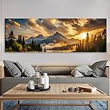
7. Incorrectly Hung Art
Artwork has the power to elevate a space, but if hung incorrectly, even the most exquisite piece can become an aesthetic detriment. A common home decor mistake is selecting art that is too small for its intended wall or hanging it at an inappropriate height, causing it to appear disconnected from the furniture below or simply “floating” aimlessly on a blank expanse.
As a general guideline, any artwork hung above furniture should span approximately half to two-thirds the length of the piece it accompanies, creating a cohesive visual unit. When in doubt, opting for a larger piece or grouping multiple smaller pieces into a gallery wall is often more effective than a single, undersized item. The bottom edge of the frame should ideally rest 8 to 10 inches (20-25cm) above the furniture piece. For art on a blank wall, the center of the artwork should be at eye level, roughly 60 inches (150cm) from the floor, a principle that can also be applied when art is positioned above furniture. Before committing to nails, use painter’s tape to outline the artwork’s dimensions on the wall. This simple visualization technique allows you to “test” the placement and adjust as needed, ensuring a perfect, harmonious fit.
8. Allowing Clutter to Take Over Your Home
Clutter is arguably the number one enemy of a well-styled and peaceful interior. A home overflowing with unnecessary items can quickly feel chaotic, detracting from any deliberate design choices and creating an atmosphere of stress rather than serenity. This pervasive interior design mistake often stems from an abundance of possessions combined with insufficient storage solutions or the temptation to display every beloved item.
Embrace the philosophy of “editing” your space; as the Marie Kondo method suggests, question whether each item “sparks joy.” If not, consider donating, discarding, or rehoming it. Furthermore, recognize the limitations of open storage, such as open shelving in kitchens or living rooms, which can quickly become visual noise if not meticulously curated. Strategic incorporation of closed storage—cabinets, chests, or stylish storage baskets—in every room is vital for concealing less aesthetically pleasing necessities like remote controls, charging cables, shoes, or beauty products. By thoughtfully organizing and streamlining your belongings, you not only reclaim physical space but also foster a sense of calm and visual clarity that allows your intentional design elements to truly shine.
9. The Pitfall of Too Much Matching
While coordination is desirable, an excess of matching furniture and decor can strip a room of its personality, making it feel bland, sterile, and akin to a furniture showroom. This common home decor mistake results in a “cookie-cutter” aesthetic that lacks the depth and uniqueness found in truly curated spaces. Beautiful interiors possess character, a narrative woven through a thoughtful blend of textures, shapes, colors, and styles that reflect the inhabitants’ journey and tastes.
Instead of purchasing an entire furniture set from a single big-box store or collection, cultivate an eclectic yet cohesive look by mixing pieces from various price points and origins. Explore flea markets, antique shops, or online marketplaces for unique, second-hand finds that can add a distinctive charm. Avoid generic word art or mass-produced artworks that often cheapen a space and lack personal resonance; seek out unique, affordable pieces from local artists or online independent platforms. By intentionally blending diverse elements—a vintage armchair alongside a modern sofa, a rustic console paired with contemporary art—you construct a dynamic, elevated space that feels authentically lived-in and deeply personal, achieving a level of sophistication that uniform matching simply cannot replicate.