Transforming a living space into a stylish sanctuary can feel like a daunting task. Many homeowners aspire to create an environment that looks polished and expensive. However, common decorating mistakes often hinder this goal. These design blunders can inadvertently make your home feel less refined. The video above highlights several key errors to avoid. It offers quick tips for immediate improvement. This article will delve deeper into these crucial home decorating concepts. We will explore how to elevate your interior design. You can achieve a sophisticated aesthetic without breaking the bank.
Understanding Common Decorating Mistakes
Creating a beautiful home involves thoughtful choices. Sometimes, small errors accumulate. They detract from your overall decor. Recognizing these missteps is the first step. You can then make impactful changes. Studies show that a well-designed home boosts mood. It also enhances productivity. Avoiding common decorating mistakes improves daily living.
Ignoring Scale and Proportion
One frequent oversight involves scale and proportion. Furniture too large for a room feels overwhelming. Small pieces can get lost in a vast space. Achieving balance is key. Every item should complement its surroundings. Consider the room’s dimensions carefully. For example, a tiny sofa in a spacious living room looks cheap. It creates an imbalance. Conversely, a massive sectional in a small room is impractical. It makes the space feel cramped.
To fix this, measure your room. Then, measure your furniture. Ensure pieces fit comfortably. Leave enough walking space. Approximately 3 feet between furniture is ideal. This allows for easy movement. Proper scale instantly elevates your home’s look.
Poor Lighting Choices
Lighting profoundly impacts a room’s ambiance. Relying on a single overhead light is a common decorating mistake. It creates harsh shadows. This flattens the space. Layered lighting is much more effective. It adds depth and warmth. Different light sources serve different purposes.
Experts suggest three types of lighting: ambient, task, and accent. Ambient lighting provides general illumination. Task lighting helps with specific activities. Accent lighting highlights features. For instance, a floor lamp provides ambient light. A desk lamp offers task lighting. A picture light showcases artwork. Combining these makes a significant difference. It transforms a room’s perceived value. Poor lighting makes even expensive items look cheap.
Elevating Your Home Decor Through Thoughtful Design
Smart design choices can make your home look expensive. Focus on quality over quantity. Invest in timeless pieces. These will last longer. They also maintain their appeal. Your home decorating journey should be enjoyable. It should also be a reflection of your style.
Addressing Clutter and Disorganization
Clutter is a major enemy of expensive-looking decor. Visible mess creates visual noise. It makes a home feel chaotic. Disorganized spaces instantly look cheap. They suggest a lack of care. A tidy environment projects calm and order. Research indicates clutter raises stress levels.
Develop effective storage solutions. Use decorative boxes and baskets. Built-in shelving can be highly functional. Purge unused items regularly. Every item should have a home. This simple act drastically improves aesthetics. It makes your space feel more luxurious.
Selecting Authentic Decor and Personal Touches
Generic, mass-produced decor lacks personality. It often looks inexpensive. A truly sophisticated home tells a story. It reflects the owner’s interests. Incorporate unique, meaningful pieces. These add character and depth. Avoid matching everything perfectly.
Hunt for vintage finds. Support local artisans. Display personal photographs thoughtfully. Create a curated collection. This approach adds authenticity. It moves beyond transient trends. Your home decor becomes uniquely yours. This personal touch is priceless.
Smart Solutions for Common Design Blunders
Many decorating errors are easily rectifiable. A little planning goes a long way. Small changes yield big results. These adjustments don’t require a large budget. They just need attention to detail. Fixing these issues enhances your home’s appeal.
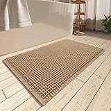
Choosing the Right Rug Sizes
An undersized rug is a pervasive decorating mistake. It floats awkwardly in the room. This makes the space appear smaller. It also looks disconnected. A properly sized rug grounds your furniture. It defines the living area. This creates visual cohesion.
For living rooms, all furniture legs should sit on the rug. Alternatively, at least the front two legs should be on it. In dining rooms, the rug should extend 24 inches beyond the table. Chairs must remain on the rug when pulled out. This creates a cohesive look. It makes the room feel larger and more finished. Studies confirm larger rugs enhance a room’s perceived size.
Mastering Curtain Placement
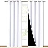
Curtains hung too low or too short are another common design blunder. This mistake chops up the wall. It makes ceilings appear lower. This gives a cramped feeling. Hanging curtains high and wide makes a room look grander. It draws the eye upwards.
Mount curtain rods 4-6 inches above the window frame. Extend them 6-12 inches beyond the frame on each side. Curtains should just skim the floor. They can also slightly puddle. This creates a more dramatic effect. Long, flowing curtains add instant elegance. They visually expand your space. This simple fix significantly impacts the room’s height.
Upgrading Wall Art and Arrangements
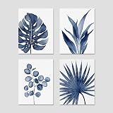
Small, isolated pieces of wall art look insignificant. They can feel cheap and afterthought-ish. Artwork should be proportional to the wall space. It should also relate to the furniture below it. Gallery walls are excellent solutions. They add interest and personality.
Consider the rule of thirds when hanging art. Ensure the center of the artwork is at eye level. This is approximately 57 inches from the floor. Larger pieces make a statement. They anchor a room. Creating a cohesive gallery wall adds sophistication. It avoids those awkward, tiny art decorating mistakes. Many homeowners underestimate the power of well-placed art.
Final Touches for an Expensive Look
Attention to detail truly distinguishes a well-decorated home. It separates a merely furnished space from a stylish one. These small considerations pack a powerful punch. They contribute significantly to the perceived value. Your efforts in home decorating will be evident.
Selecting Quality Materials and Finishes
Cheap-looking materials can undermine your entire design. This includes flimsy furniture and poor textile choices. Invest in durable, tactile fabrics. Choose solid wood furniture when possible. Even small accents matter. Think about hardware and fixtures. Upgrading these makes a difference. For example, swapping plastic knobs for metal ones. This small change adds instant sophistication. It elevates your home’s perceived quality.
Ensuring Cohesion and Flow
A home that lacks cohesion feels disjointed. Each room should relate to the others. This creates a harmonious flow. Think about color palettes and styles. Do they complement each other? Consistency doesn’t mean uniformity. It means thoughtful connection. This prevents your home from looking like a collection of random parts. It gives a sense of completeness. This helps avoid common decorating mistakes related to overall design.
From Cheap to Chic: Your Decorating Q&A
What does ‘scale and proportion’ mean in home decorating?
It means making sure your furniture and decor items are the right size for your room, so nothing looks too big or too small for the space.
Why is good lighting important for making a room look nice?
Good lighting adds depth and warmth, making a room feel more refined, while relying on just one light source can create harsh shadows and make it look cheap.
How does clutter impact the look of a home?
Clutter creates visual mess and makes a home feel chaotic and disorganized, which instantly gives a cheap impression.
What’s a common mistake people make with area rugs?
Using an undersized rug is a common mistake that makes the space appear smaller and disconnected. A properly sized rug should anchor your furniture.
Where should curtains be hung to make a room look better?
Curtain rods should be mounted 4-6 inches above the window frame and extend 6-12 inches beyond it, with curtains just skimming the floor, to make the room look grander.