As thoughtfully highlighted in the accompanying video, one of the most pervasive missteps observed in interior styling involves the selection of wall decor that proves disproportionately small for its intended surface. This common decorating mistake frequently results in an aesthetic that appears unfinished or lacking cohesion, often prompting an erroneous belief that additional items are required to complete the visual narrative. In reality, the fundamental issue often lies not in a lack of quantity, but rather in a significant misapplication of the essential design principle known as scale, particularly in relation to the wall or the foundational furniture positioned beneath the artwork. Understanding and accurately applying this principle is paramount for achieving a balanced and polished interior.
Understanding the Principle of Scale in Interior Design
The principle of scale in interior design, a cornerstone of visual harmony, refers specifically to the size of an object or a collection of objects in relation to another object, a space, or the human form. When elements within a room are appropriately scaled, a sense of equilibrium and order is effortlessly conveyed, contributing significantly to the overall comfort and aesthetic appeal. Conversely, when elements are incorrectly scaled, the space can feel either overwhelmingly cramped or sparsely empty, creating a psychological disconnect that detracts from the intended ambiance. This foundational concept extends beyond individual items, influencing how entire arrangements are perceived within their architectural context.
The distinction between scale and proportion is often subtle but significant within design lexicon. While scale addresses the absolute size of an item, proportion pertains to the relative sizes of different parts of a whole or of different elements within a composition. A piece of art, for instance, might be of an appropriate scale for a large wall, but if its internal elements are out of proportion, the visual impact can still be jarring. A successful interior is typically achieved through a meticulous consideration of both scale and proportion, ensuring that all components exist in a harmonious relationship with one another and the surrounding environment.
The Critical Role of Wall Art Scale
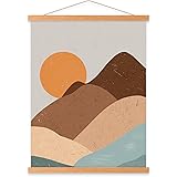
The strategic placement and sizing of wall art are indisputably critical in establishing a room’s focal point and dictating its overall character. An appropriately scaled piece of art has the capacity to anchor a space, drawing the eye and providing visual weight that can balance even the most substantial furniture arrangements. When wall art scale is misjudged, however, the visual impact can be significantly diminished, often resulting in pieces that appear to float aimlessly on an expansive wall or conversely, overpower a more delicate setting. This careful consideration of art placement is not merely decorative but fundamentally structural to the spatial design.
Consideration must also be given to how art dimensions influence the perceived volume of a room. Large-scale art can paradoxically make a smaller room feel more expansive by providing a singular, compelling visual statement that prevents the eye from dwelling on the confined perimeters. In contrast, numerous small pieces haphazardly arranged on a vast wall can inadvertently emphasize the wall’s emptiness, failing to fulfill their potential as cohesive design elements. The thoughtful application of optimal wall art scale therefore becomes an indispensable tool in the interior designer’s repertoire for crafting dynamic and inviting environments.
Implementing the 60-75% Rule for Optimal Art Placement
As demonstrated in the video, a practical guideline for achieving optimal wall art scale is to ensure that your artwork or collective display occupies approximately 60 to 75% of the available wall width above a piece of furniture. This prescriptive range is not arbitrary; it represents an empirically derived sweet spot for visual balance and aesthetic satisfaction in most residential and commercial settings. To implement this effectively, precise measurements are necessary, specifically focusing on the height and width of the clear wall space situated directly above the furniture item that the art is intended to complement. This method ensures that the artwork functions as an integrated extension of the furniture rather than an isolated entity.
For instance, if a sofa measures 90 inches in width, the ideal artwork grouping would span between 54 and 67.5 inches. This systematic approach effectively prevents the common predicament where a diminutive piece of art becomes lost above a substantial furnishing, diminishing its decorative potential and leaving a sense of visual incompleteness. The rationale behind this 60-75% rule is rooted in design principles that favor creating a visually grounded and proportional arrangement, allowing the art and furniture to engage in a harmonious dialogue. Such careful consideration of wall art scale ultimately contributes to a highly refined and professionally curated interior.
Beyond the Single Piece: Curating Art Collections and Galleries
While the single, large statement piece offers a straightforward application of scale principles, the curation of art collections and gallery walls introduces a more intricate challenge that also benefits from a systematic approach. When designing a gallery wall, the collection should ideally be perceived as a singular, cohesive unit, and its overall dimensions are then assessed against the 60-75% rule relative to the furniture or wall space beneath. This holistic perspective ensures that even an assortment of diverse pieces contributes to a unified aesthetic statement, preventing a fragmented or chaotic appearance that often arises from individual items being evaluated in isolation.
The effective use of negative space is particularly vital when arranging multiple artworks, as the unoccupied areas between frames significantly influence the perceived scale and visual weight of the entire composition. A consistent spacing between individual pieces, typically ranging from 2 to 4 inches, often contributes to a more polished and intentional presentation, allowing each artwork adequate breathing room without disrupting the collective harmony. The strategic arrangement of these elements, encompassing both the art itself and the interstitial spaces, is fundamental to mastering wall art scale within a dynamic collection, thereby transforming a simple grouping into a sophisticated display.
Common Pitfalls and Advanced Considerations in Wall Decor
Addressing the ‘Too Small’ Wall Art Conundrum
The recurrent issue of wall art being undersized for its designated space is frequently observed, serving as a primary contributor to a room’s unfinished aesthetic. This predicament typically arises when a singular, modest piece is tasked with occupying a vast expanse, inevitably causing it to appear dwarfed and insignificant within the larger context. To circumvent this common decorating mistake, several strategic approaches can be employed, moving beyond the simple addition of more items that fail to address the core issue of scale. A deliberate adjustment in the approach to wall decor is often required to elevate the design.
One effective solution involves the consolidation of multiple smaller artworks into a cohesive gallery wall, treating the entire arrangement as a unified entity that then satisfies the 60-75% scale guideline. Alternatively, the selection of a dramatically large statement piece can instantaneously resolve the imbalance, serving as a powerful focal point that commands attention and appropriately fills the wall. Integrated shelving systems that combine art, objects, and books within a single architectural framework also offer a sophisticated method for establishing significant visual weight and dimension, ensuring that the wall decor contributes meaningfully to the overall spatial harmony.
The Interplay of Art and Furniture Scale
The symbiotic relationship between the scale of wall art and the furniture positioned beneath it is a fundamental consideration in achieving a balanced interior. The dimensions and visual weight of a piece of furniture should invariably dictate the appropriate scale of the artwork selected to accompany it. A substantial, overstuffed sectional sofa, for example, necessitates a significantly larger or more impactful piece of art compared to a slender, minimalist console table. Failure to acknowledge this interplay can lead to artwork appearing either overwhelmed by its neighboring furniture or, conversely, dominating a delicate arrangement.
Furthermore, the style and height of the furniture also play a crucial role in defining the ‘available’ wall space, even within the general 60-75% rule. A tall headboard, for instance, naturally reduces the vertical expanse suitable for art, requiring a more horizontal or strategically placed collection. When evaluating the suitability of wall art, designers often consider the visual mass and perceived volume of the furniture, ensuring that the chosen art does not merely fill space but actively enhances the furniture’s presence. This meticulous attention to the interaction of elements is paramount in creating a coherent and visually appealing room, where every component contributes to a harmonious wall art scale.
Utilizing Negative Space Effectively
The judicious management of negative space, or the unoccupied area surrounding an artwork, is as crucial to aesthetic success as the placement of the art itself. This “breathing room” serves to visually separate elements, allowing each piece to be fully appreciated without competing for attention. Insufficient negative space can lead to a cluttered and overwhelming visual experience, diminishing the impact of individual artworks and making the entire arrangement feel cramped. Conversely, an excessive amount of negative space can cause art to appear isolated or adrift, failing to establish a meaningful connection with its surroundings.
The skillful manipulation of negative space around wall decor ensures that the artwork is appropriately framed by its environment, enhancing its prominence while maintaining spatial equilibrium. In a gallery wall context, consistent spacing between pieces, alongside the substantial negative space around the entire grouping, creates a sense of deliberate curation rather than haphazard assembly. It is through this thoughtful interplay between positive and negative space that the full potential of wall art scale is realized, culminating in a highly sophisticated and perceptually satisfying interior.
The Broader Impact of Scale on Room Cohesion
The careful consideration of wall art scale extends far beyond mere decorative aesthetics; it fundamentally influences the overall cohesion, functionality, and comfort of an entire room. When all elements within a space—from major furniture pieces to the smallest accessories—are in appropriate scale with one another and the room’s architecture, a sense of seamless flow is established. This harmonious arrangement allows for effortless navigation and a pleasant sensory experience, contributing significantly to the perceived comfort and livability of the environment. The proper application of design principles, particularly scale, ensures that a space feels both complete and inviting.
Discrepancies in scale can disrupt this delicate balance, causing a room to feel disjointed or uncomfortable, even if individual items are appealing in isolation. For example, an oversized chandelier in a low-ceilinged room or a minuscule rug in a vast living area can create visual discord that undermines the entire design effort. Therefore, the consistent application of suitable scale to all interior elements, including wall decor and its intricate wall art scale, is not merely a stylistic choice but a critical determinant of a room’s success in terms of both its visual appeal and its fundamental experiential qualities.
Hanging Your Questions: Getting the Scale Right
What is a common mistake people make when hanging art?
A common mistake in interior styling is selecting wall decor that is too small for the intended wall space or the furniture it is placed above. This often makes a room look unfinished.
What does ‘scale’ mean in interior design?
In interior design, scale refers to the size of an object or a group of objects compared to another object, the overall room, or a person. When elements are appropriately scaled, a room feels balanced and harmonious.
How can I choose the right size art to hang above furniture?
A practical guideline is the ’60-75% rule.’ This means your artwork or art grouping should occupy approximately 60 to 75% of the width of the furniture it hangs above, like a sofa.
What should I do if my wall art seems too small for a large wall?
If individual pieces are too small, you can combine multiple smaller artworks into a cohesive gallery wall. Treat this entire collection as one unit that follows the 60-75% scale guideline for the space.