Interior design plays a crucial role in shaping how we experience our homes, influencing everything from our mood to our daily routines. While many homeowners aspire to create spaces that feel luxurious, inviting, and thoughtfully curated, several common interior design mistakes can inadvertently make a home appear cheap or dated. These errors often stem from outdated trends, budget-conscious choices that compromise quality, or simply a lack of awareness regarding fundamental design principles.
The accompanying video provides a candid look at some prevalent design missteps that can diminish a home’s aesthetic appeal. Building upon those insights, this article delves deeper into each of these interior design pitfalls, offering expanded explanations and actionable solutions. Understanding these mistakes is the first step toward transforming your living spaces, ensuring they reflect sophistication and intention rather than common oversights. Let’s explore how to identify and rectify these elements, creating a home that truly feels elevated and inspiring.
Beyond the Wall: Reimagining Furniture Layout for Flow and Function
A prevalent interior design mistake, as highlighted in the video, involves pushing all furniture against the walls. While this approach might seem intuitive for maximizing space, especially in smaller rooms, it often creates a disconnected and less inviting atmosphere in larger areas. When sofas and chairs are spread too far apart, the room can feel cavernous, making conversation awkward and intimate gatherings difficult. This layout often lacks a sense of purpose, signaling an amateur approach to space planning.
To cultivate a more luxurious and thoughtful environment, consider designing your living room around a central focal point. This could be a fireplace, a large television, an impressive piece of art, or even a stunning window view. Instead of simply lining the perimeter, float your furniture away from the walls to create distinct zones and foster interaction. Grouping a sofa with armchairs, a coffee table, and perhaps a side table forms a cohesive conversation area, making the space feel more connected and inviting. Ideally, seating should be arranged within 8-10 feet of each other to facilitate comfortable dialogue, preventing guests from feeling like they need to shout across the room. Experimenting with different arrangements can dramatically alter a room’s functionality and perceived value.
Illuminating Style: Upgrading Beyond “Boob Lights”
The notorious “boob light” epitomizes builder-grade lighting, a common interior design mistake often associated with homes designed for mass appeal and cost efficiency. While these fixtures provide basic illumination, they typically offer nothing in terms of style, character, or flattering light quality. Their uninspired design and mediocre performance immediately signal a budget-driven approach, detracting from any efforts to create a sophisticated interior. Recognizing the impact of lighting is crucial for transforming a space.
Effective lighting design involves creating a dynamic plan that incorporates multiple light sources at varying levels throughout a room. This layered approach ensures balanced illumination, eliminates harsh shadows, and enhances the overall ambiance. Instead of relying solely on a single overhead fixture, integrate ambient lighting (general room illumination), task lighting (for specific activities), and accent lighting (to highlight features). Consider swapping out dull overheads for interesting semi-flush mounts, chandeliers, or even vintage schoolhouse lamps. Supplement these with floor lamps, table lamps, sconces, and LED strip lighting to add depth and warmth. Dimmers are also invaluable for controlling intensity, allowing you to adjust the mood and create a more flattering light temperature for occupants. Selecting fixtures made from materials like fluted glass, brass, rattan, or linen can introduce texture and visual interest, elevating your space instantly.
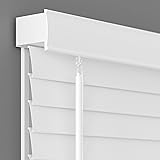
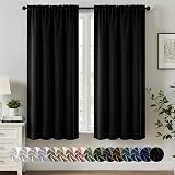
Window Wardrobe: Ditching Plastic Blinds for Elegant Treatments
Plastic horizontal or vertical blinds are another pervasive interior design mistake that immediately cheapens a home’s appearance. These “giving nothing” window treatments are often chosen for their low cost and ease of installation, but they fall short on aesthetics, functionality, and hygiene. They are notorious dust magnets, difficult to clean thoroughly, and prone to breaking or yellowing over time. Furthermore, their rigid, uninspired look fails to add any texture, color, or softness to a room, leaving windows feeling bare and unconsidered.
Upgrading your window treatments offers a significant opportunity to inject personality and luxury into your space. Consider Roman shades in rich linen or woven wood for a tailored, elegant look that provides excellent light control and privacy. Roller blinds in subtle patterns or textures can offer a minimalist yet sophisticated alternative. For a truly luxurious feel, drapes or curtains in quality fabrics like velvet, silk blends, or even substantial cotton can add dramatic height, color, and softness. Layering sheer curtains under heavier drapes allows for flexible light filtering and privacy throughout the day. Motorized shades add a touch of modern convenience and luxury. Choosing materials and designs that complement your existing decor will enhance the overall cohesion and perceived value of your home, transforming a functional necessity into a design statement.
Hardware as Jewelry: Elevating Cabinets with Thoughtful Pulls
Hollow T-bar cabinet hardware is frequently found in builder-grade homes, representing a common interior design mistake that conveys a cheap and uninspired aesthetic. These mass-produced pulls are not only incredibly boring and lacking in character but often feel flimsy to the touch. The video aptly describes them as failing to add “jewelry” to your space, which is precisely what well-chosen hardware should do. Cabinet hardware serves as the finishing touch, much like accessories complete an outfit, and generic options severely undersell the potential for elegance.
Beyond their dull appearance, T-bar pulls often present a practical annoyance: their propensity to snag clothing, leading to frustrating tears and snags. Upgrading your cabinet hardware is a surprisingly impactful and relatively inexpensive way to refresh a kitchen or bathroom. Explore a vast array of materials and designs that can instantly elevate your cabinetry. Options range from classic brass, polished nickel, or matte black for a contemporary look, to more unique choices like ceramic, glass, leather, or even natural stone such as marble. Vintage pulls sourced from antique shops or flea markets can introduce unparalleled charm and a sense of history. Consider different forms such as cup pulls, classic knobs, or various handle shapes to match your home’s style. Thoughtful hardware selections demonstrate an attention to detail that contributes significantly to a space’s luxurious feel.
Artistic Elevation: Mastering the Art of Hanging Low
One of the most common and easily rectifiable interior design mistakes is hanging art too high on the wall. This seemingly minor error, which costs nothing to correct, can make a room feel disjointed and amateurish. When artwork is placed near the ceiling, it appears disconnected from the furniture and the people in the room, forcing viewers to crane their necks. The video humorously notes that such high placement often looks “comically high,” lacking the thoughtful integration seen in professionally designed spaces.
Proper art placement dictates that artwork should generally be hung at eye level. For most individuals, the center of the artwork should be approximately 57-60 inches from the floor, allowing it to be comfortably viewed by someone standing. When hanging art above a piece of furniture, such as a sofa or console table, ensure there is a natural connection between the two elements. A good rule of thumb is to position the bottom edge of the frame about 6-8 inches above the top of the furniture, anchoring the piece visually. This creates a cohesive vignette that feels intentional and balanced. While scale can be playfully experimented with, a large piece close to the ceiling rarely works. Remember, the goal is for the art to engage with the room’s inhabitants and other decor, not float aimlessly in the upper reaches of the wall.
Underfoot Finesse: Investing in Quality Rugs
Polyester rugs, while often marketed as durable or washable, frequently fall victim to the interior design mistake of prioritizing cost over quality and feel. The video points out the inherent disappointment when a visually appealing rug turns out to be made of plastic, failing to deliver the luxurious, plush sensation expected underfoot. While the recycling aspect is commendable, the longevity and aesthetic appeal of these synthetic rugs often prove to be lacking over time. They tend to feel overtly plasticky, betraying their inexpensive origins.
A rug’s material significantly impacts both its appearance and how it feels to walk on barefoot. Natural fiber rugs, particularly those made from 100% wool, offer unparalleled durability, softness, and a rich, inviting texture that synthetics struggle to replicate. Wool rugs are also excellent insulators and often age beautifully, becoming heirlooms rather than temporary fixes. Jute rugs, although not as soft, provide an honest, natural texture and a rustic charm that synthetic versions cannot mimic. They are a good option for entryways or mudrooms where durability and natural texture are prioritized. While washable synthetic rugs have their place for practicality, especially in homes with pets or children, it is vital to be discerning. Always check the return policy when buying online, as the tactile experience is crucial. A genuinely good quality rug, even if a higher initial investment, offers lasting comfort, beauty, and significantly elevates the overall feel of a room, preventing it from looking cheap.
Bedding Bliss: Layers Over a “Bed in a Bag”
The “bed in a bag” set is a pervasive interior design mistake that prioritizes convenience and low cost over quality, comfort, and sophisticated aesthetics. As noted in the video, these all-in-one packages typically feature inferior materials, often a polyfill batting that lacks the luxurious weight and drape of proper bedding. This approach leads to a flat, uninspired look where the comforter never quite drapes elegantly over the mattress, creating a perpetually cheap appearance. The convenience of a pre-matched set often comes at the expense of genuine style.
To achieve a truly premium and inviting bedroom, adopt a layered bedding strategy. Start with a high-quality duvet insert, ideally down, feather, or a substantial down alternative, which provides superior loft and comfort. Pair this with a separate duvet cover made from natural fibers like linen, cotton percale, or sateen. This allows for easy washing, seasonal swaps, and greater design flexibility. Unlike integrated comforters, duvet covers can be changed out as styles evolve or if wear and tear occur, preserving the expensive insert underneath. Beyond the duvet, incorporate high-quality sheets, a soft throw at the foot of the bed, and a mix of decorative pillows. This layered approach adds depth, texture, and visual interest, making the bed a luxurious focal point. Investing in individual, quality bedding pieces ensures both superior comfort and a more refined, adult aesthetic that avoids the common interior design mistake of cheap, matchy-matchy sets.
Beyond the Bold Stroke: Rethinking the Random Accent Wall
The random accent wall represents an interior design mistake that, while once trendy, now often makes a home feel dated and unsophisticated. The video critiques the arbitrary selection of one wall to paint a different color, suggesting that if you’re uncomfortable using a color throughout the entire room, perhaps that particular shade isn’t suitable for your space. This approach often stems from a fear of commitment to a bold hue, resulting in a visually unbalanced room where one wall shouts while the others whisper, creating a disconnected aesthetic.
Rather than a solitary accent wall, consider more integrated and timeless approaches to adding color or texture. If you love a particular color, embrace it and paint all the walls in the room. This creates a cohesive and immersive experience, making the space feel more intentional and sophisticated. Alternatively, use wallpaper on all walls for a similar impactful effect. For those seeking visual interest without overwhelming color, explore architectural treatments like wainscoting, board and batten, or even vertical wood slats. These elements add inherent texture and dimension, which can then be painted a contrasting or complementary color to create a more integrated feature. When changing paint colors, aim for natural transition points such as archways, door casings, or room dividers, ensuring a logical flow from one space to the next. This thoughtful application of color and texture avoids the pitfall of the random accent wall, preventing your home from looking cheap by association with an outdated interior design mistake.
From ‘Cheap’ to Chic: Your Interior Design Q&A
Why shouldn’t I push all my furniture against the walls?
Pushing furniture against walls can make a room feel disconnected and less inviting. Instead, floating furniture creates distinct zones and encourages better interaction.
What are “boob lights” and why are they considered a design mistake?
“Boob lights” are common, basic overhead light fixtures often found in builder-grade homes. They lack style and character, immediately making a space look cheap or dated.
Why should I avoid plastic blinds for my windows?
Plastic blinds can make a home look cheap, dated, and they are difficult to clean. Elegant window treatments like Roman shades or drapes can add personality and luxury to your space.
How high should I hang artwork on my walls?
Artwork should generally be hung at eye level, with the center of the piece around 57-60 inches from the floor. If placed above furniture, ensure the bottom edge is about 6-8 inches above the furniture.
Why are “bed in a bag” sets not recommended?
“Bed in a bag” sets often use inferior materials and lack the luxurious weight and drape of quality bedding. Layering individual pieces creates a more refined and comfortable bedroom aesthetic.