Elevate Your Home: Unpacking Design Mistakes That Cheapen Your Space
Many homeowners invest heavily in furnishings. Yet, their spaces often lack a truly polished look. The underlying issue is not always cost. Instead, common design mistakes quietly diminish perceived quality. This guide complements the video above. It dives deeper into key design principles. We will explore how thoughtful choices transform your home. Achieve a curated, high-end feel without overspending.
Overcoming Vertical Compression: The Missing Upper Half
Rooms often feel compressed. Most design efforts concentrate on floor-level elements. Sofas, tables, and beds dominate the lower third. This approach creates a bottom-heavy aesthetic. Your eye gets stuck at waist height. Consequently, the upper half of the room remains visually empty.
Achieving vertical balance is crucial. Design experts recommend a three-layer approach. Focus on lower, middle, and especially the upper layers. Introduce elements that draw the eye upwards. Tall floor lamps are effective. Bookcases and wall sconces add height. Pendants or chandeliers provide overhead interest. Even strategically hung curtains can make a difference. Aim for one or two elements reaching the upper third. This ensures a comfortable visual flow.
Consider the psychology of space. Taller elements suggest openness and grandeur. Studies indicate that high ceilings correlate with cognitive freedom. Utilize vertical space to enhance this feeling. Integrate built-in shelving or wall-mounted art clusters. Even large, sculptural plants create dynamic vertical lines. Your space will feel more expansive. This intelligent use of height avoids a ‘squat’ appearance.
Beyond Showroom Style: Ditching Flat-Pack Overload and Matchy Sets
Flat-pack furniture offers convenience and affordability. However, an entire room of these pieces can appear sterile. The “showroom in a box” effect lacks personality. Overly coordinated sets signal a lack of effort. This often reduces a room’s perceived value.
The issue extends beyond matching pieces. Many flat-pack items share similar characteristics. Thin panels, simple shapes, and printed finishes are common. Individually, these are acceptable. Collectively, they result in a flat, one-dimensional space. Contrast is the antidote to this uniformity.
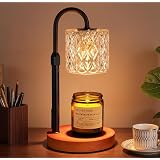
Curate your selections from diverse sources. Mix different eras, materials, and silhouettes. Seek out items with visual weight or intricate details. A vintage solid wood side table provides character. A sculptural lamp introduces an artistic element. Even upgrading basic hardware adds significant tactile value. Research shows that unique, varied textures enhance sensory engagement. This makes a space feel more thoughtful. It suggests an intentional, collected aesthetic. Avoid rooms that shout “assembly required.”
Curbing Generic Decor and Artificial Accents
Generic decor lacks soul. Mass-produced prints, like word art or generic cityscapes, feel impersonal. If an item could fit into any Airbnb, it doesn’t feel special. Your home should reflect your unique story. Every display item should pass a simple test. Is it beautiful, functional, or meaningful?
Meaningful art personalizes your space. Commission a local artist. Display personal photography. Frame a beloved album cover. Even public domain prints gain charm when well-framed. These choices resonate on a deeper level. They tell your story, not a universal one. Research confirms personal items increase emotional connection to a space.
Plants undeniably enhance well-being. However, obviously fake plants detract from realism. Large, artificial specimens can undermine the entire room’s authenticity. Choose natural-looking faux plants if real ones aren’t feasible. Modern manufacturing offers incredibly realistic options. Their subtle imperfections mimic nature. This ensures they don’t betray their artificiality. Material honesty extends to botanicals, too.
Mastering Color: Beyond the Single Pop Cushion Strategy
A room doesn’t look cheap from lack of color. It suffers from a lack of variation. Repeating the exact same shade across multiple elements falls flat. This “single pop cushion strategy” lacks depth. True color mastery involves a richer palette.
Focus on color families, not single tones. Beautiful rooms often feature a dozen distinct tones. These are variations of a few core colors. If deep green is your accent, use different shades. Incorporate olive, emerald, and forest green. Spread these across diverse materials. Velvet, linen, ceramics, and paint all interact uniquely with color. This creates subtle shifts in hue and texture. It adds visual richness while maintaining cohesion.
Even neutral spaces benefit from this principle. Mix creams, oats, sands, and camels. Vary their material applications: a boucle chair, a linen throw, a ceramic vase. This layering prevents a flat, monotonous appearance. It elevates “beige” to “rich and nuanced.” Studies in color theory emphasize the importance of tonal variation. This creates optical interest. It makes a room feel intentionally designed, not haphazard.
Flawless Window Furnishings: Avoiding Flimsy, Short, or Poorly Fitted
Windows are significant architectural features. Poorly dressed windows can undermine a room’s entire aesthetic. Several common mistakes cheapen the appearance. Thin, sheet-like curtains lack substance. Panels that are too narrow or too short shrink a space. Flimsy vertical blinds look temporary and unconsidered. Mounting curtains too low visually reduces ceiling height.
Elevate your window treatments strategically. Hang curtains high and wide. Position rods closer to the ceiling than the window frame. Extend panels past the window frame on each side. This visually stretches the wall. It makes the room feel taller and more expansive. For fullness, curtains should be 1.5 to 2 times the window’s width. This ensures a luxurious drape, even when closed. Three optimal lengths exist: off the floor, touching the floor, or puddled. Each offers a distinct aesthetic, but avoid awkward hovering.
Custom curtains are an investment. However, clever techniques enhance ready-made options. Purchase extra panels for desired fullness. Clip rings offer height adjustment. Hem tape provides no-sew length customization. For specific windows, Roman shades or cafe curtains are excellent alternatives. Research into perceived luxury often cites tailored elements. Well-fitted window treatments signal meticulous attention to detail. They transform a room, much like a well-tailored suit.
Embracing Material Honesty and Texture
Bad faux finishes immediately cheapen a space. Printed marble or vinyl flooring with loud, repetitive grain screams inauthenticity. The issue isn’t the material itself. It’s the attempt to mimic something it’s not. Real materials exhibit subtle variations and depth. Faux versions often appear uniform and flat. Our brains are adept at detecting these discrepancies.
Opt for restrained patterns in laminates or porcelain. These are easier to imitate convincingly. They won’t draw negative attention. Wood veneer offers genuine texture. It uses a real wood layer over an affordable core. Engineered wood flooring provides the look of solid timber. It features a hardwood top layer for authenticity. Prioritize materials that are true to their nature. This principle, known as “material honesty,” underpins quality design.
Texture adds crucial depth. Layer tactile materials into your design. Think linen, wool, ceramics, stone, and visible wood grain. For refined aesthetics, incorporate marble, velvet, or glass. For a casual feel, choose rattan, clay, or raw timber. Adding just one genuine material element makes an impact. A stone tray, a timber side table, or a ceramic lamp can instantly elevate a space. Studies on sensory design emphasize the importance of varied textures. They create a more engaging and welcoming environment.
Upgrading Beyond Builder-Grade Everywhere
Many homes feature builder-grade elements. Recessed ceiling lights, basic bathroom mirrors, and standard hardware are common. These choices minimize cost and simplify construction. However, they result in a generic, uninspired feel. Replacing these defaults transforms a space.
Start with a layered lighting strategy. Relying solely on overhead lights creates a flat, unflattering illumination. Introduce floor lamps, table lamps, wall sconces, and pendants. Aim for three to five light sources per room. This creates ambiance and depth. Good lighting enhances mood and perceived value. Swapping a “boob light” for a semi-flush mount is a quick upgrade. It dramatically improves aesthetic appeal.
Hardware acts as jewelry for cabinetry. Replacing basic knobs and handles offers instant impact. Choose pieces with presence and quality. This small detail influences daily interaction. It signals intentional design. Research indicates that tactile elements improve user experience. Don’t overlook wall color either. A fresh coat of paint, properly sampled, completely shifts a room’s atmosphere. Moving beyond default choices creates a home that truly reflects you.
Forging a Red Thread: Connecting Rooms for Cohesion
A home can feel disjointed. This happens when design choices lack relation. Unrelated colors, clashing metals, and disparate wood tones create randomness. The absence of a “red thread” undermines cohesion. This principle applies within single rooms and across the entire home.
Repetition creates rhythm and intention. Repeat elements at least twice within a room. If a walnut coffee table is present, echo that walnut. Use it in a picture frame or another furniture piece. Brass in a lamp can reappear in hardware or a mirror. Pick up rug colors in cushions or artwork. This doesn’t mean everything must match exactly. It ensures each design choice has a visual “friend.” This intentional repetition provides visual harmony.
Extend this cohesion throughout your home. Each room can have its unique personality. Yet, a connecting thread should persist. This might be a consistent wood tone. Perhaps a deeper version of a color family. A similar architectural language can also tie spaces together. This subtle connection signals a well-considered design. Your brain registers these relationships. This makes the entire home feel welcoming and thoughtfully planned. Design mistakes often stem from a lack of intentional connection. A “red thread” ensures a unified aesthetic.
Deconstructing the Accent Wall Problem
Accent walls frequently fall short of their potential. They often appear cheap or ill-conceived. Two common missteps stand out. The “lonely wall” lacks an anchor. A bold color or paneling without a fireplace or architectural detail draws attention to nothing. This makes the wall feel unjustified. The “half-committed feature” is another mistake. Partial paneling or slats fail to frame anything properly. This signals hesitation. It leaves the room feeling off-balance.
Intentionality is paramount for successful accent walls. Commit fully to the concept. If you love a color or pattern, consider applying it to all walls. This envelops the room in a statement. If highlighting a single wall, ensure it supports a focal point. A bed head wall is an ideal candidate. A wall with a credenza and mirror also works well. If adding paneling, integrate it seamlessly. Ensure it spans from edge to edge. This avoids an “afterthought” appearance. It makes the feature feel built into the room’s architecture.
Often, a flat room is the real issue. An accent wall is seen as a quick fix. However, deeper design principles offer superior solutions. Decorate vertically to add dimension. Incorporate varied textures. Curate your furniture thoughtfully. Repeat color families and materials. These foundational strategies eliminate the need for an accent wall. They create a rich, interesting space organically. Addressing fundamental design mistakes ultimately elevates your home’s aesthetic.
Ask the Experts: Transforming Your Home from Cheap to Chic
What is ‘vertical compression’ in home design?
Vertical compression happens when most of your design focuses on low-level items, leaving the upper part of the room visually empty. This can make a room feel smaller or ‘squat’ instead of open.
Why should I avoid using too much matching furniture or only flat-pack items?
Relying heavily on matching sets or all flat-pack furniture can make your room look sterile and lack personality, resembling a showroom. Mixing different styles, materials, and eras helps create a unique and curated feel.
How can I improve the look of my window curtains?
To make windows look better, hang curtains high and wide, positioning the rod closer to the ceiling and extending it past the window frame. Ensure your curtains are full enough (1.5 to 2 times the window’s width) and reach the floor for a polished look.
What does ‘material honesty’ mean in home decor?
Material honesty means choosing materials that are authentic and true to their nature, rather than using bad faux finishes that try to imitate something they’re not. This adds genuine texture and depth to your space.
How can I make different rooms in my home feel connected?
To connect rooms, create a ‘red thread’ by subtly repeating design elements like specific colors, wood tones, or metal finishes throughout your home. This repetition creates visual harmony and makes your entire space feel cohesive.