Are Common Interior Design Mistakes Making Your Home Look Cheap?
You’ve scrolled through countless inspiration boards, invested in new furniture, and carefully chosen your color palette. Yet, sometimes, despite all your efforts, your home might still feel a little… underwhelming. If you’ve been grappling with the feeling that your living space isn’t quite reflecting the sophisticated vibe you’re aiming for, you’re not alone. The video above dives deep into ten common interior design mistakes that can inadvertently make your home look cheap, but understanding these pitfalls is just the first step. This guide expands on those key insights, offering actionable advice and creative solutions to transform your space from basic to bespoke.
Achieving a luxurious or high-end aesthetic doesn’t always require an unlimited budget. Often, it’s about making smart choices, understanding fundamental design principles, and injecting personality. We’ll explore how subtle shifts in your approach to art, lighting, scale, and even materials can dramatically elevate your home’s appeal, ensuring it feels curated and welcoming rather than generic or inexpensive. Let’s uncover these design blunders and discover how to correct them, making your home a true reflection of your unique style.
1. Ditch the Generic Art and Word Quotes
One of the quickest ways to cheapen a space is by filling its walls with generic, mass-produced art or, worse, those ubiquitous word quotes like “Live, Laugh, Love.” As the video aptly points out, prints from big-box stores like IKEA or Home Goods, featuring iconic cityscapes or rustic wildlife, are often chosen out of convenience to fill a blank wall. While accessible, their widespread availability means millions of people likely own the exact same piece, instantly diminishing any sense of uniqueness or personal touch in your home.
Instead of opting for art that blends in with every other home, consider cultivating a collection that truly speaks to you. This doesn’t mean breaking the bank on original masterpieces; thrifting is a fantastic alternative for discovering unique prints, vintage photographs, or even interesting frames that can be repurposed. DIY projects also offer a chance to infuse personal creativity, whether it’s painting your own abstract piece or framing meaningful mementos. Remember, art should reflect your personality, travels, or aspirations, acting as a conversation starter rather than mere wall filler. A blank wall, thoughtfully considered, often looks more sophisticated than one adorned with uninspired, generic art.
2. Reconsider Cropped Curtains: Aim for Height and Drama
The “cropped curtain” mistake, as highlighted in the video, is a seemingly minor detail that can have a surprisingly significant impact on a room’s perceived height and luxury. Curtains that barely skim the windowsill or hang awkwardly short create a visual break that chops up the wall space, making your windows and, by extension, your entire room appear smaller and less grand. It’s akin to wearing trousers that are too short for your legs – they just don’t create an elegant line.
To elevate your windows, hang curtain rods several inches (or even closer to the ceiling) above the window frame, extending them beyond the frame’s width by at least 6-12 inches on each side. This simple trick creates the illusion of taller, wider windows and a more expansive room. Ensure the curtains themselves are long enough to “kiss” the floor, gently brushing it, or even puddle slightly for a more traditional, luxurious look. The quality of the fabric also matters; steer clear of flimsy, sheer gauze or dusty, outdated materials. Opt for substantial fabrics like linen, velvet, or a heavy cotton blend that drape beautifully and add a sense of weight and texture to the room, enhancing both its visual appeal and insulation.
3. Embrace Texture: The Silent Language of Luxury
A space devoid of texture can feel flat, sterile, and uninviting, ultimately making it look cheap. Texture refers to the tactile quality of a surface, but also how our eyes perceive that quality. When everything in a room is smooth, glossy, or uniform, it lacks visual interest and depth. Think of a room entirely furnished with hard, unvaried surfaces – it feels cold and unapproachable, like a forgotten office space.
Integrating a variety of textures is crucial for creating a rich, layered, and luxurious environment. This doesn’t necessarily mean adding more “stuff” but rather choosing items with different tactile and visual qualities. Incorporate a plush wool rug, a chunky knit throw, velvet pillows, woven baskets, or even exposed brick or wood elements. These diverse textures provide contrast and intrigue, allowing your eyes to “feel” the room as you scan it. Even in a monochrome palette, varying textures from matte to glossy, rough to smooth, can create dynamic visual interest, making the space feel intentionally designed and far from cheap.
4. Banish the “Boob Light”: Multi-Source Lighting is Key
The singular, often uninspired, overhead light fixture – affectionately dubbed the “boob light” in the video – is a classic hallmark of builder-grade design that immediately signals a lack of thought and budget. Relying solely on one overhead source creates harsh, downward-casting shadows, flattening the room’s features and making everything appear dull and uninviting. It’s like trying to light an entire theatrical production with a single spotlight from above; the drama and nuance are lost.
Sophisticated lighting design employs multiple layers and sources to create ambiance and highlight different areas of a room. Think of it like painting with light. Start with ambient lighting (the general illumination, which can still be an overhead fixture, but an attractive one), then add task lighting (for reading or working, like a desk or floor lamp), and finally accent lighting (to highlight art, plants, or architectural features). Incorporate dimmer switches for flexibility. Investing in a few well-chosen, stylish lamps – available at surprisingly affordable prices from retailers like Amazon or Wayfair – can dramatically transform the mood and perceived value of your space, making it feel dynamic and inviting rather than flat and cheap.
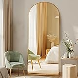
5. Get Your Scale Right: Avoiding the “Postage Stamp” Effect
One of the most common interior design mistakes is choosing items that are too small for the space, particularly rugs and art. A tiny rug in a sprawling living room can look comically out of place, like a postage stamp in the middle of a desert, failing to anchor the furniture or define the living zone. Similarly, a small piece of art on a large wall can appear insignificant and lost, betraying a lack of intentionality in the design.
Understanding scale and proportion is crucial for a balanced and harmonious room. When selecting a rug, aim for one large enough to comfortably accommodate at least the front two legs of all major seating pieces. In larger rooms, ideally, all furniture legs should rest on the rug, creating a cohesive grouping. For art, consider the wall it’s going on; a single, large-scale piece often makes a more dramatic and luxurious statement than several small, disparate ones. If multiple smaller pieces are your preference, arrange them as a thoughtful gallery wall, ensuring they collectively fill a suitable proportion of the wall space. Saving up for the right-sized piece or creatively layering smaller rugs can be far more effective than settling for an ill-fitting item that cheapens the overall look.
6. Steer Clear of Shiny, Glossy, Fake Surfaces
Materials matter. The video rightly highlights how shiny, glossy, plastic, or “foil” surfaces – often found in inexpensive furniture like particle board with a printed veneer – can instantly make a space feel cheap. These materials, while budget-friendly and durable, often lack the depth, character, and tactile quality of natural materials. They can appear mass-produced and artificial, like a poorly done imitation of something genuine.
While some of these pieces can be useful in a pinch or for specific functional needs, a home entirely furnished with them will struggle to achieve a sophisticated aesthetic. The solution lies in mixing and balancing. Pair an IKEA media console with a vintage wooden coffee table, or complement a laminate dining table with chairs made of solid wood or upholstered fabric. Introduce elements like stone, ceramic, natural wood, or metal to add authenticity and richness. These honest materials bring warmth, character, and a sense of permanence that fake surfaces simply cannot replicate. Aim for a blend that feels curated rather than a showroom display of uniform, synthetic finishes.
7. Address Cheap Flooring: A Foundation for Luxury
Flooring is often considered a “fixed element” in a home, making it challenging and expensive to change. The video acknowledges this difficulty, yet firmly states that cheap flooring—particularly low-grade laminate or certain luxury vinyl planks (LVP)—can significantly detract from a home’s overall appearance. These materials often feature screen-printed wood grains that look artificial, wear down over time, or simply mimic natural materials without capturing their inherent beauty and texture.
While natural hardwood or engineered wood floors are often the gold standard for a luxurious look, practical considerations like pets or children might make durable options like LVP appealing. The key is to choose higher-grade options that offer more realistic textures and patterns, reducing the “plastic” appearance. If replacing flooring isn’t an immediate option, strategic placement of high-quality area rugs can work wonders. A well-chosen rug can cover up less-than-ideal flooring, introduce texture, define zones, and add a layer of warmth and sophistication. Think of a beautiful rug as a stylish band-aid for your flooring woes, instantly elevating the perceived value of the room.
8. Upgrade Wimpy Baseboards, Casings, and Hollow Doors
These architectural details often go unnoticed until you see a home that gets them right. Wimpy, small, builder-grade baseboards and door casings are subtle cues that can downgrade a home’s aesthetic, making it feel less substantial and less finished. They are akin to wearing an ill-fitting suit; even if the fabric is good, the cut just doesn’t work. The video also touches on hollow core doors, which not only feel flimsy but also offer poor soundproofing, contributing to a less solid and luxurious feel.
Upgrading these elements can yield surprisingly impactful results. Opt for taller baseboards (5 inches or more) with a more interesting profile, or even a simple, substantial flat stock. Similarly, choose casings that are robust and well-proportioned to your doors and windows. These details provide a strong visual frame for your walls and openings, giving the room a sense of solidity and craftsmanship. Swapping out flimsy hollow doors for solid core versions is a more significant investment, but the improved feel and sound insulation contribute immensely to a sense of luxury and quality within your home. These small, often overlooked, architectural details build the foundation of a sophisticated interior.
9. Avoid the “Matchy-Matchy” Trap: Seek Cohesion, Not Repetition
While the concept of “cohesion” is paramount in interior design, many people confuse it with “matching everything perfectly.” The video points out that an entire living room suite bought from the same collection – a sofa, loveseat, and armchair all in identical fabric, or a bedroom set with matching dresser, nightstands, and bed frame – creates a static, uninteresting space. It lacks depth and the feeling of having been thoughtfully curated over time, instead appearing like a furniture showroom display.
True cohesion comes from finding pieces that are related in style, color palette, or texture, but not exact duplicates. Think of them as siblings, not identical twins. For instance, your various seating pieces could share a similar design era or a complementary color family, but vary in fabric or silhouette. Play with tints, tones, and shades within your chosen color palette to add nuance. Incorporate different materials, textures, and even periods in your furniture and decor to create a layered, rich, and more personal narrative. This approach allows each piece to shine while contributing to a harmonious whole, making your home feel unique, collected, and intentionally designed rather than cheap and generic.
10. Declutter and Curate: The Open Shelving Dilemma
Open shelving is a popular trend, but “too much open shelving,” especially when used to display everyday clutter or unattractive electronics, can make a space feel messy, overwhelming, and ultimately cheap. The video emphasizes that displaying everything you own, particularly practical items like remotes or gaming consoles, adds visual noise and detracts from any intentional design efforts. It’s like having your entire wardrobe strewn across your bedroom floor rather than neatly organized in a closet.
The solution is not to eliminate open shelving entirely, but to approach it with intention and a ruthless eye for editing. Closed storage systems – think media consoles with drawers or cabinets – are invaluable for hiding unsightly but necessary items, allowing your eye to rest and appreciate the curated elements. When using open shelves, choose only items that are aesthetically pleasing or hold sentimental value, creating small, artful vignettes. Consider functionality and frequency of use; if you need a remote constantly, find an attractive tray or small box to contain it. By intentionally selecting what you display and stashing away the rest, you create a sense of calm and order, which is a hallmark of a well-designed and luxurious home, rather than one that feels perpetually cluttered and cheap.
Q&A: Elevating Your Home from ‘Cheap’ to Chic
Why should I avoid generic art or word quotes in my home?
Generic, mass-produced art and word quotes can make your home feel impersonal and cheap because many others have the exact same pieces. Instead, choose unique art that reflects your personality, travels, or aspirations.
How should I hang curtains to make my windows and room look better?
Hang curtain rods several inches above your window frame and extend them beyond the width of the window. Ensure the curtains are long enough to gently touch or slightly puddle on the floor, which makes the room feel taller and more luxurious.
Is using only one main overhead light fixture a good idea for a room?
No, relying solely on one overhead light fixture can create harsh shadows and make your room feel dull and flat. Instead, use multiple layers of lighting, including ambient, task, and accent lights, to create a more inviting and dynamic atmosphere.
Should all my furniture pieces match exactly, like a complete set?
It’s best to avoid buying entire ‘matchy-matchy’ furniture sets as they can make a space feel generic and uncurated. Aim for cohesion by selecting pieces that relate in style, color, or texture, but vary in design to create a more personal and layered look.
How can I make sure my open shelving doesn’t look cluttered?
To avoid cluttered open shelving, use closed storage for everyday items and only display a few aesthetically pleasing or sentimental pieces. This intentional approach helps create a sense of order and sophistication rather than visual noise.