Many homeowners discover that their neutral living spaces, despite significant investment, often lack warmth, depth, and visual interest. As highlighted in the video above, a neutral interior doesn’t have to equate to a bland or uninspired environment. It is entirely possible to craft a rich, inviting, and sophisticated home without relying on vibrant colors. This detailed guide expands on key principles for transforming your neutral home decor from merely functional to truly extraordinary.
Achieving a captivating neutral interior involves understanding subtle nuances in design that elevate a space beyond basic beige. The goal is to create a layered aesthetic where every element contributes to a cohesive, thoughtfully curated look. By focusing on specific design techniques, you can ensure your neutral home feels anything but boring, reflecting a sophisticated and harmonious style.
Distinguishing Neutral from Monochromatic in Home Decor
A common misconception leads many to believe that neutral automatically means monochromatic, but these terms describe distinct approaches to home design. Monochromatic design strictly employs varying shades and tints of a single color, creating a unified yet potentially one-dimensional look. In contrast, neutral home decor embraces a broader spectrum of muted tones that are inherently subtle and versatile, providing a foundation for diverse textures and patterns.
True neutral palettes include a range of colors such as beiges, creams, pale greens, soft greys, and muted browns. These foundational hues allow for greater flexibility in layering different elements without introducing overwhelming pops of color. Understanding this distinction is the first crucial step toward developing a truly dynamic and appealing neutral interior, moving away from a flat, single-tone appearance.
Mastering the 60-30-10 Rule for Neutral Color Palettes
Implementing the 60-30-10 rule is an effective strategy for creating balanced and engaging neutral color palettes within any interior design scheme. This design principle dictates that 60% of your space should be a dominant color, forming the background and largest areas. Thirty percent should be a secondary color, providing contrast and adding depth, while the remaining 10% serves as an accent color, offering small, impactful details.
For neutral homes, this could translate to 60% soft beige walls and large furniture pieces, 30% muted grey or cream for secondary furniture and textiles, and 10% pale sage green or a rich, deep brown as an accent. The key lies in selecting colors with consistent undertones to ensure harmony across the room. This structured approach helps prevent your neutral home decor from feeling haphazard or overwhelmingly uniform.
Incorporating Varied Patterns and Prints in Neutral Interiors
The absence of pattern often contributes significantly to a flat, uninspired neutral space, yet many avoid patterns fearing they will introduce too much visual clutter. However, contemporary neutral designs thrive on subtle patterns that add interest without relying on bold colors. Move beyond traditional florals or overly rustic block prints to discover patterns that enhance rather than detract from your neutral aesthetic.
Consider introducing sophisticated grid patterns, geometric designs, or abstract motifs that subtly break up expanses of solid color. A rug, like the Bowie rug mentioned in the video, with a neutral grid pattern in brown and cream, provides both visual structure and a sense of elongation to a room. Such patterns contribute to a contemporary design style, bolstering your overall aesthetic while maintaining a strictly neutral palette. These thoughtful choices provide visual texture and complexity without overwhelming the serene atmosphere of your neutral home decor.
The Art of Texture Maxing: Layering Materials for Depth
A key to enriching neutral home decor involves “texture maxing,” which means incorporating a diverse range of materials and finishes into your space. When a room features too many items made from the same material, such as all linen, it loses tactile tension and appears visually flat. The strategic interplay of various textures creates a multi-sensensory experience, making your neutral interior more inviting and dynamic.
Explore materials that diffuse light uniquely or possess distinct tactile qualities. For instance, luxurious suede pillows not only offer a buttery-soft touch but also visually texturize a space through their interaction with light. Similarly, velvet pillows add a powerful visual component, appearing different depending on the angle and ambient light, providing a rich, layered effect. Materials like thick wool, chunky knits, bouclé, raw wood, and polished stone each contribute distinct visual and tactile characteristics, transforming a neutral room into a deeply engaging environment.
Elevating Your Space: Designing from Floor to Ceiling
Many neutral spaces make the mistake of stopping the design at sofa level, leaving vast expanses of wall and ceiling untouched. To truly invigorate a neutral home, extend your design efforts vertically, ensuring every surface contributes to the room’s overall aesthetic. This comprehensive approach transforms a bland room into a fully realized and sophisticated environment.
Walls: Beyond Empty Spaces
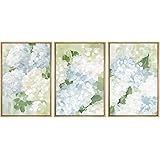
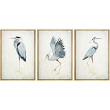
Empty walls convey a sense of incompleteness, rather than minimalism. Adorn your walls with neutral wall art, selecting pieces that resonate with your design style without introducing jarring colors. Think large-scale abstract pieces, framed botanicals, or minimalist photography. Alternatively, consider textural wall coverings like lime wash, Roman clay, or sophisticated wallpapers with subtle patterns.
Wall sconces and strategically placed mirrors also serve to carry the eye upwards, adding both functional lighting and decorative elements. These additions define your space and reflect your interior design style, making your neutral home feel curated and complete.
The Critical Role of Lighting in Neutral Interiors
The type of light emitted by your bulbs profoundly impacts the ambiance of a neutral interior. Neutral spaces aim for warmth, coziness, and an earthy feel, which necessitates warmer, dimmer lighting. Avoid harsh, cool white light, often measured at 5000K or higher, which can make a neutral room feel sterile and unwelcoming, reminiscent of a doctor’s office.
Instead, opt for light bulbs with a Kelvin temperature between 2700K and 3000K, which emit a soft, warm glow. This subtle adjustment dramatically alters the mood, enhancing the rich textures and nuanced colors of your neutral home decor. Additionally, consider layering your lighting with ambient, task, and accent lights to create depth and highlight specific areas, allowing shadows to define and segment your space effectively.
Ceilings: An Overlooked Design Opportunity
Even your ceiling offers an opportunity to convey interior design style through thoughtful choices. While replacing light fixtures can be a significant investment, the fixture itself is a powerful design statement. However, if a new fixture is not feasible, focus on the light bulbs as discussed. This simple change can profoundly impact the perceived warmth and coziness of your neutral space, contributing to an overall inviting atmosphere.
Bringing Life: Botanicals and Metallic Accents
Two often-forgotten elements that can dramatically enhance neutral home decor are botanicals and metallic accents. These additions inject life and vibrancy into a space without compromising the chosen neutral color scheme, creating necessary contrast and visual appeal.
The Natural Vibrancy of Botanicals
Many incorrectly believe that plants and greenery introduce too much color into a neutral palette. However, botanicals, whether real or faux, infuse a space with an unparalleled sense of liveliness and organic warmth. They bring the outdoors in, reminding us of nature and adding a fresh, vibrant touch that complements the muted tones of a neutral interior. From a large faux tree anchoring a corner to a simple vase of dried pampas grass on a coffee table, botanicals enhance depth and draw attention to other textural elements you have incorporated.
Shine and Contrast with Metallics
Metal accents provide a crucial element of shine and reflection that organic materials often lack, adding vibrancy and sophistication to neutral spaces. While black metal can sometimes fall flat, options like silver, chrome, gold, or brass effectively reflect light and create visual interest. Gold and brass, in particular, offer a warm undertone that aligns beautifully with the cozy, earthy feel of many neutral designs.
Consider incorporating metals with unique patinas or unlacquered finishes for added character and depth. These metallic elements introduce a necessary “harshness” or contrast to the softness of textiles and the airiness of neutral items. This careful balance ensures your neutral home decor feels rich and dynamic, preventing it from appearing bland or unfinished.
Breaking Repetition for Dynamic Neutral Design
An emphasis on repetition, such as using the same paint color, foundational furniture, or rug style throughout an entire home, often leads to a monotonous neutral interior. While consistency is good, excessive uniformity can make a space feel uninspired and lacking individuality. Varying design elements within your chosen neutral palette is crucial for creating distinct, engaging areas.
Instead of replicating identical elements, switch the roles of your 60-30-10 colors from room to room. For example, if brown is 60% in one living area, make it 30% or 10% in an adjacent open-concept space. This variation allows you to maintain a cohesive neutral home decor scheme while giving each room its own unique character. Changing the color of foundational pieces or types of rugs within the same neutral family also helps divide and define spaces, preventing your home from feeling like a single, undifferentiated zone.
Your Neutral Decor Blind Spots: Q&A
What is the difference between neutral and monochromatic home decor?
Monochromatic design uses varying shades of a single color, while neutral decor uses a broader range of subtle, muted tones like beiges, greys, and creams. This allows for more versatility and layering.
How can I make a neutral room feel less boring or flat?
To make a neutral room more dynamic, focus on ‘texture maxing’ by incorporating diverse materials, adding subtle patterns, and using warm, inviting lighting. These elements create depth and visual interest.
What is the 60-30-10 rule in neutral interior design?
The 60-30-10 rule suggests that 60% of your space should be a dominant color, 30% a secondary color for contrast, and 10% an accent color for impactful details. This helps create a balanced and engaging palette.
What kind of lighting is best for a neutral home?
For a warm and cozy neutral interior, it’s best to use light bulbs with a Kelvin temperature between 2700K and 3000K. Avoid harsh, cool white light, which can make the space feel sterile.
Can I use plants and metallic accents in a neutral decor scheme?
Yes, botanicals (real or faux plants) add life and organic warmth, while metallic accents like gold or brass provide shine and contrast. Both enhance depth and vibrancy without compromising the neutral palette.